
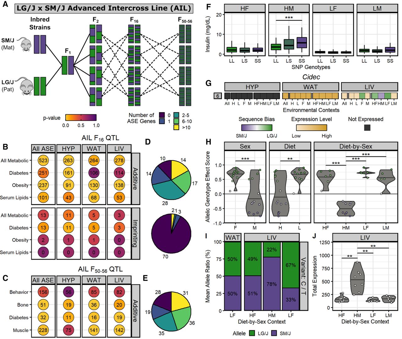
Integrating ASE and QTL data reveal Cidec as a candidate gene for insulin levels. (A) Breeding scheme for the LG/J x SM/J advanced intercross line. We calculated enrichment of tissue-specific ASE gene sets (x-axis) in trait-specific AIL QTL sets (y-axis) among sequence-dependent ASE genes in additive F16 QTL (top) and parent-of-origin-dependent ASE genes in imprinting F16 QTL (bottom) (B), and sequence-dependent ASE genes in additive F50–56 QTL (C). Circle color corresponds to the enrichment P-value. Numbers indicate the total overlapping ASE genes in each QTL set. (D,E) Tally of how many AIL QTLs contain each range of ASE genes: 0 (purple) to more than 10 (yellow). Pie charts match their adjacent ASE gene and QTL set intersections. (F) The AIL F16 QTL Ddiab6d showed context-dependent additive effects. Box plots of serum insulin levels across SNP rs6393943 genotypes in F16 mice (LL, LG/J homozygous; LS, heterozygous; SS, SM/J homozygous). The x-axis is grouped by diet-by-sex context: (HF) high fat females; (HM) high fat males; (LF) low fat females; and (LM) low fat males. Horizontal bars denote mean phenotypes. (***) P ≤ 0.001; assessed by Student's t-test. (G) Cidec had a context-dependent switch in sequence bias direction within LIV. ASE heatmap of Cidec across tissues-by-context analyses (for full description, see Fig. 4 or 5). (H) Cidec ASE biases had significant sex, diet, and diet-by-sex effects. Violin plots display individual AGE scores for Cidec (y-axis) across environmental contexts (x-axis). Horizontal bars denote mean AGE scores. Dots are color coded by their sequence bias. (**) P ≤ 0.01, (***) P ≤ 0.001; assessed by ANOVA (sex, diet) or Tukey's post hoc tests (diet-by-sex). (I) Cidec ASE profile in LIV and WAT was validated by pyrosequencing. Bar graphs denote mean allelic ratios (y-axis) in select cohorts (x-axis) and are color coded by allele (LG/J, green; SM/J, purple). (J) Cidec had significantly higher expression in HM. Violin plots of total expression levels in LIV (y-axis) for each diet-by-sex context (x-axis). (**) P ≤ 0.01; assessed by Student's t-test.


