
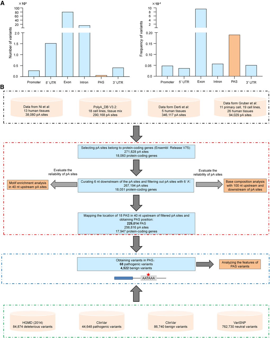
Figure 1.
Genomic distribution of pathogenic variants and pipeline for obtaining variants in PAS. (A) Number (left) and frequency (right) of pathogenic variants in different genomic locations. The frequency is normalized to the average length of each genomic region. (B) Flowchart for identifying potential PAS locations in the human genome.


