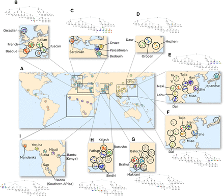
Fine-scale human population structure. Shown is a visualization of the PST on a world map. Each open circle corresponds to one of the 52 groups of the HGDP data set; group coordinates from Rosenberg (2011) were used, but adjusted such that circles do not overlap (for group labels, see Supplemental Fig. S3). Individuals were positioned randomly within their corresponding circles and colored according to the finest-scale cluster to which they were assigned. To illustrate fine-scale structure at a local level, a variety of regions are shown in detail. (A) World map, with colors corresponding the coloring of the entire PST, as in Figure 4. (B) Branch corresponding to Europe. (C) Branch corresponding to the Mediterranean region. (D) Branch corresponding to northern China. (E) Branch corresponding to Japan and central and southern China. (F) Branch corresponding to central and southern China. (G) Branch corresponding to Balochi, Brahui, and Makrani groups. (H) Branch corresponding to Burusho, Kalash, Pathan, and Sindhi groups. (I) Branch corresponding to sub-Saharan Africa. In each inset, the branch has been re-colored according to an automatic coloring scheme, which assigns closer colors to clusters positioned closer in the PST, except in B and G, where each cluster was assigned a color manually, irrespective of positioning in the PST.


