
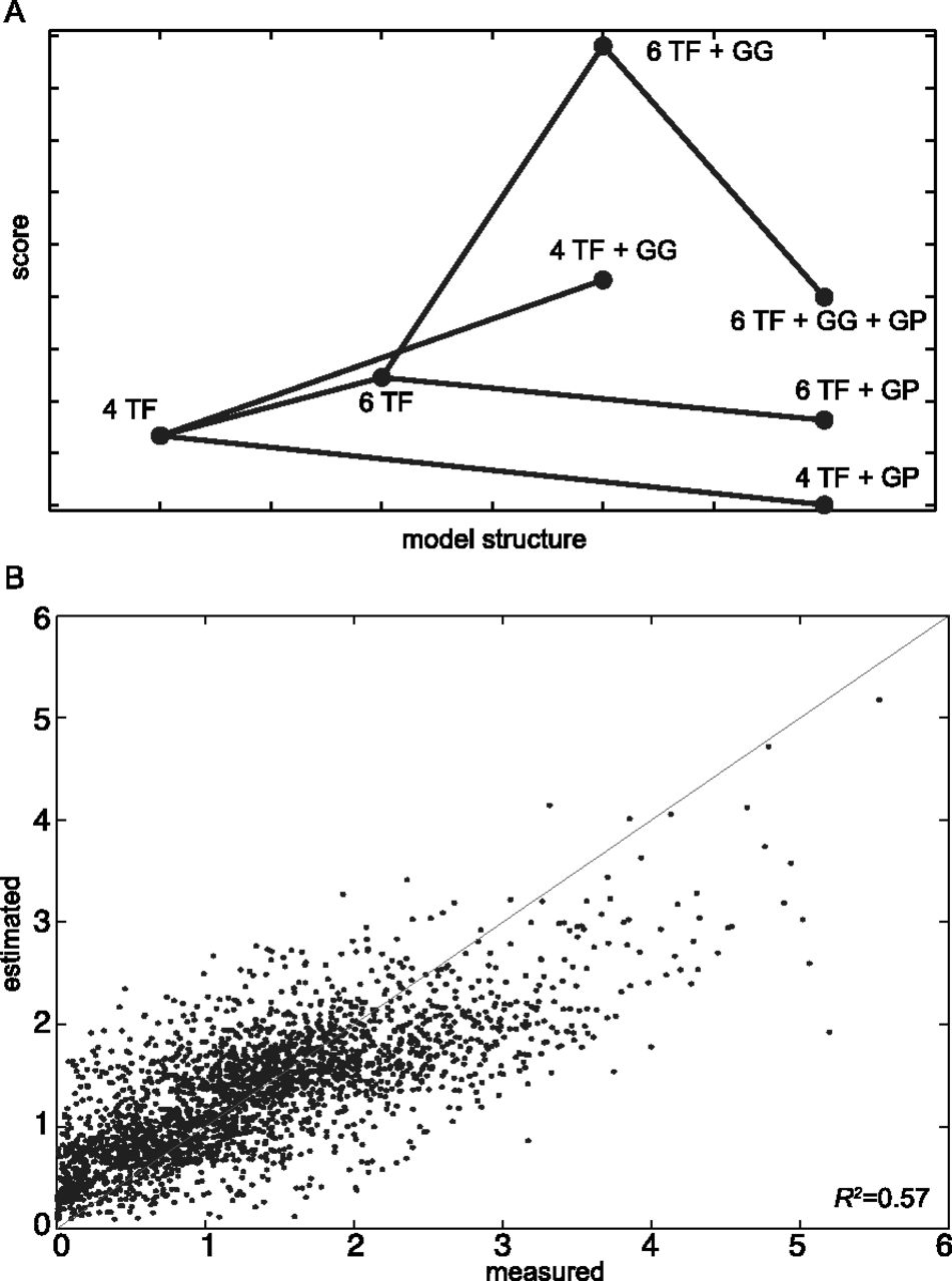
(A) Several model structures with different sets of rules have been applied to the data. Each dot represents a specific model, whose score is on the y-axis. The score is plotted as the absolute value of the AIC score, calculated taking into account the RSS and a penalty term for the number of free parameters (Methods). An increase in the plotted score (thus a decrease in the AIC score) indicates a better model. Increasing the number of TFs included in the model from four to six increases the score. The addition of the Gcr1-Gcr1 (GG) interaction always results in a better score. The addition of the Gcr1-Rap1 (GP) interaction always results in a worse score. The model with the best score is the one with six TFs and the Gcr1-Gcr1 interaction. All models represented in this plot include the Mig1-Mig1 interaction. (B) The thermodynamic model with six TFs and Gcr1-Gcr1 interaction accurately predicts synthetic promoter gene expression. Each dot represents expression driven by one of the 2534 CREs we assayed in this study. The measured CRE-seq expression is on the x-axis, while the predicted expression from the thermodynamic model is shown on the y-axis. R2 = 0.57 shows that our model explains 57% of the variance in the data. The line represents the perfect model (R2 = 1).


