
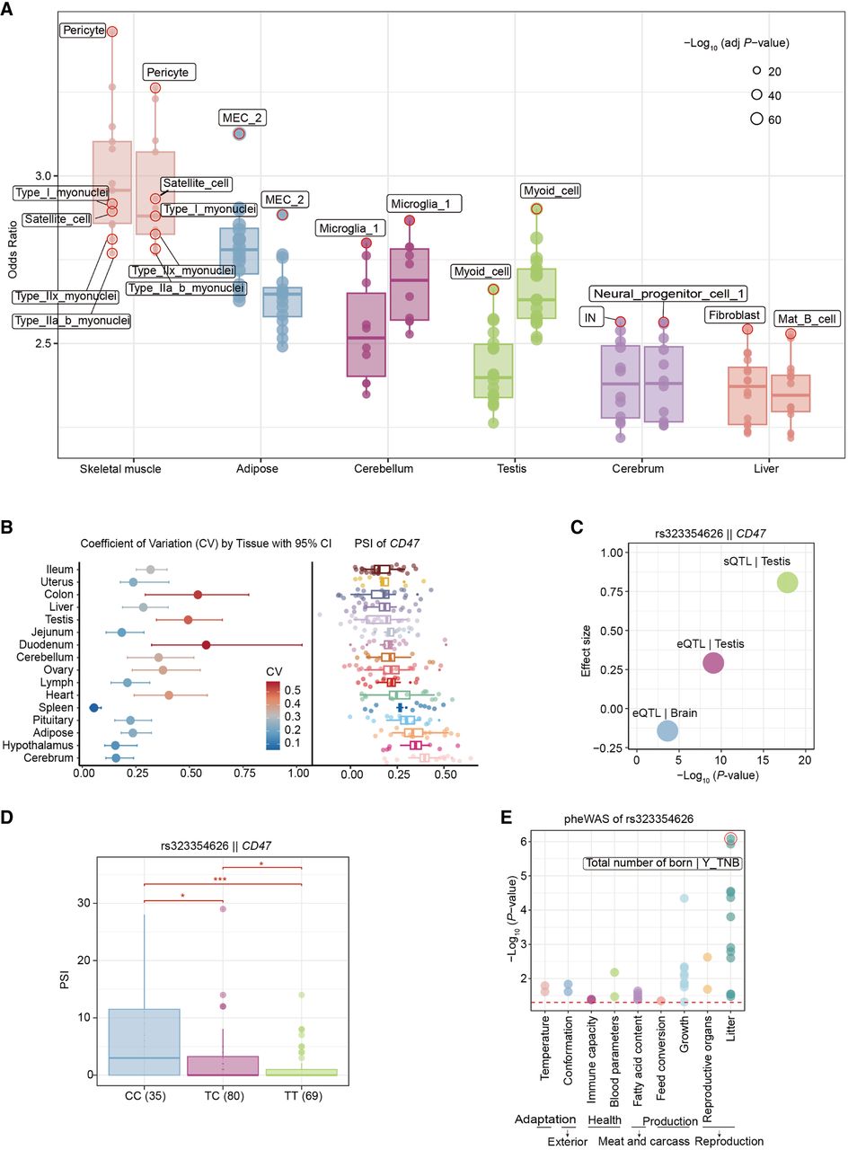
Analysis of the differences in 3′ UTR among different cell types and its impacts on genotype and phenotype. (A) Enrichment of 3′ UTR by eQTLs and sQTLs in different cell types. The box plot and dot plot on the left represent the data of eQTLs, whereas the data of sQTLs are on the right. The fill and border colors of each box plot represent different types of organization. The size of the point represents the significance. (B) Coefficient of variation and PSI analysis of CD47 across different tissues. The left panel shows the coefficient of variation (CV) with its 95% confidence intervals for different tissues. The right panel displays the PSI values of the CD47 gene in these tissues. (C) The scatter plot displaying the relationship between effect sizes and statistical significance for eQTLs and sQTLs related to CD47 expression and splicing. (D) The PSI distribution of CD47 gene under different genotypes (CC, CT, and TT). This chart includes point plots and box plots, where different colors are used to represent each genotype. (E) Dot plot presenting the pheWAS analysis results of SNP rs323354626 in different biological characteristic categories. Each point represents the strength of the association between a specific phenotype and rs323354626, represented by a negative logarithmic 10 transformation of P-values. The color of the dots distinguishes different subcategories, and there is also a red dashed line in the graph, indicating a significance threshold with a P-value of 0.05.


