
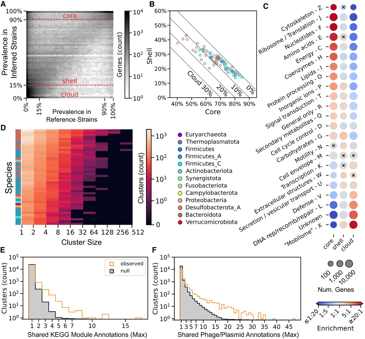
StrainPGC reveals patterns of gene content variation across dozens of species. (A) Gene prevalence across inferred strains from HMP2 is very similar to prevalence in reference genomes. Combining genes from all species, the 2D histogram shows the joint distribution of prevalence estimated from reference genomes (x-axis) and inferred strains (y-axis). These independent estimates are highly concordant, with higher density along the diagonal. Dashed horizontal lines represent the thresholds defining core, shell, and cloud prevalence classes based on inferred strains. (B) Fraction of shell versus core genes in inferred strains. For each species (circle), x- and y-values are the median gene content in the core and shell classes, respectively. The remaining gene content is composed of cloud genes and is indicated by the dotted diagonal lines. Markers are colored by phylum. Analogous results calculated using reference genomes are shown in Supplemental Figure S2. (C) Enrichment (red) or depletion (blue) in genes of various functional categories in each of the core, shell, and cloud prevalence classes. Dots representing each COG category (rows) and prevalence class (columns) are colored by odds ratio, with red and blue indicating enrichment and depletion, respectively. Dot size reflects the number of genes in that prevalence class that are in the given functional category. All enrichments/depletions shown are significant (two-tailed Fisher's exact test; P < 0.05), except for those marked with a black cross. COG categories A, B, and Y are omitted, as these had very few members (173, 74, and zero genes, respectively). (D) Gene co-occurrence clusters based on estimated gene content. The heatmap depicts histograms for each of 44 species (rows) of cluster sizes (columns). Colors indicate the number of clusters in each interval, and labels along the x-axis indicate the bounds of the intervals (left, exclusive; right, inclusive). Colors on the left indicate phylum as elsewhere. (E,F) The maximum number of related annotations in each co-occurrence cluster. The orange histogram represents the observed distribution, and the gray region is the mean in each bin across 100 random permutations of cluster labels (i.e., the null distribution). The higher number of clusters with multiple, shared annotations in the observed data compared with the null suggests clumping of the KEGG module (E) and phage or plasmid genes into co-occurrence clusters (F).


