
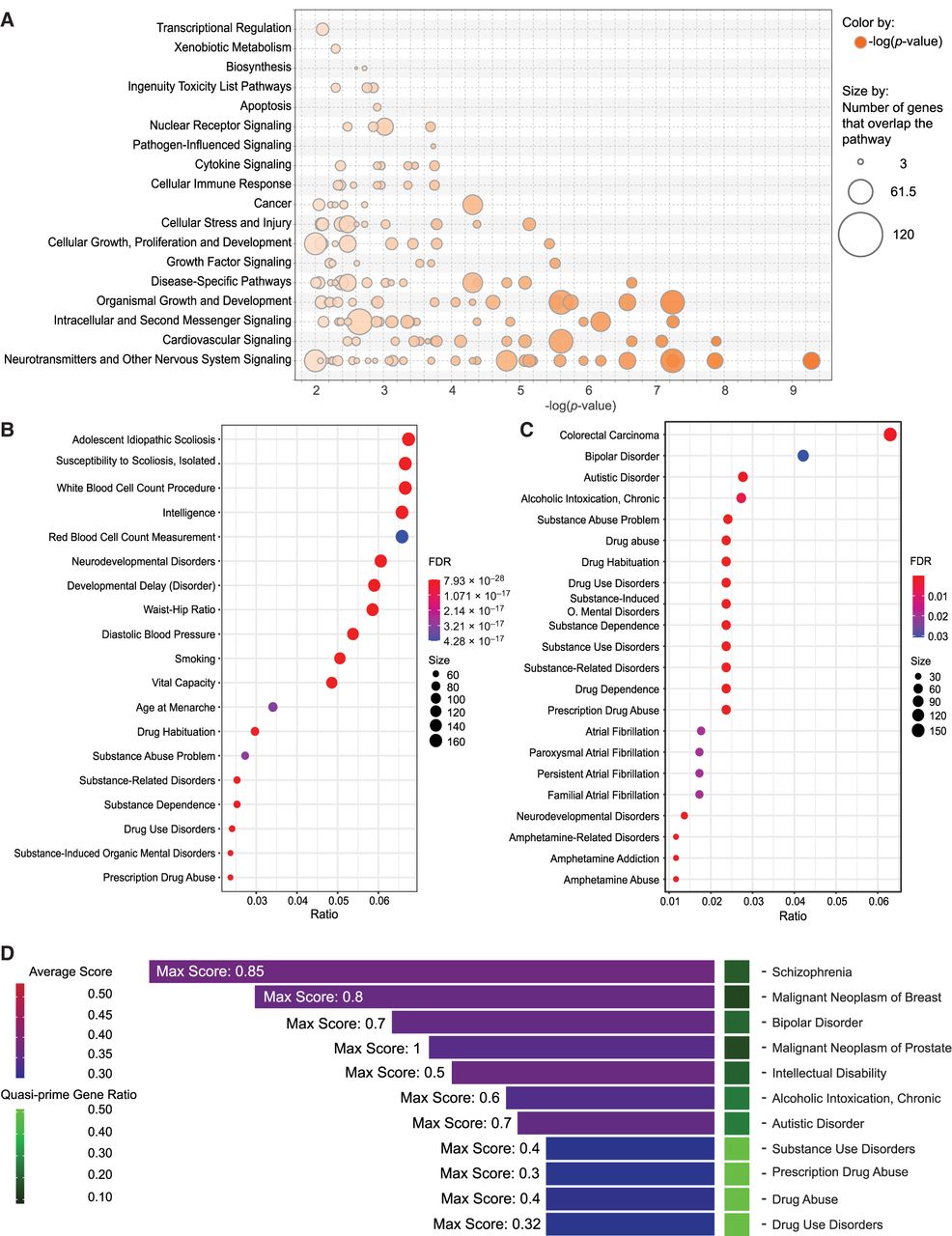
Functional and clinical disease associations of quasi-prime genes. (A) Bubble plot showing the enriched pathway categories from IPA analysis of quasi-prime genes. The size of each bubble represents the proportion of genes in the pathway having human quasi-primes, and the color represents the adjusted P-value of the enrichment. (B) DisGeNET enrichment dot plot showing the top characteristics associated with all quasi-prime genes present in “all” DisGeNET databases. (C) DisGeNET enrichment dot plot showing the top characteristics associated with all quasi-prime genes present in the “CURATED” DisGeNET database. The dots represent the characteristic association score, and the color represents the number of genes in common between the gene set and the disease/characteristic. (D) Gene disease bar plot presenting the count of associated genes across different disease conditions for all diseases with more than six associated genes. The average disease association score for all quasi-prime genes for a given disease within “all” DisGeNET databases is visualized in the color of the bar. The maximum score for all genes within a disease is displayed in text on figure. The number of quasi-prime genes out of the total genes annotated in the database is represented as a ratio shown in the heatmap tile.


