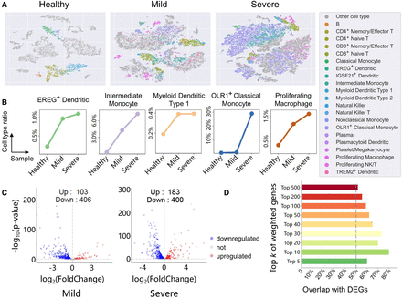
Cell annotation and DEG analysis for COVID-19. (A) t-SNE projection of COVID-19 data sets including healthy, mild, and severe samples. Colored points represent immune cells except for macrophage (for the clarity in figure, macrophage has been removed owing to its excessive number of cells). Each color represents one cell type, and gray points represent cells not belonging to immune types. (B) Because the number of cells in each data set differs, the line charts exhibit the ratio of cell populations instead of cell numbers. These populations consist of EREG+ dendritic, intermediate monocyte, myeloid dendritic type 1, OLR1+ classical monocyte, and proliferating macrophage, which correlates with the progression of COVID-19. The x-axis is samples, and the y-axis is ratios of cell population. (C) Volcano plots of DEGs detected from scRNA-seq data of mild and severe patients. The number of upregulated and downregulated genes is marked on the graph. (D) Bar chart compares the overlap of top k genes selected by scHGR with DEGs in severe patients. Supplemental Figure S7 shows the overlap corresponding to mild patients.


