
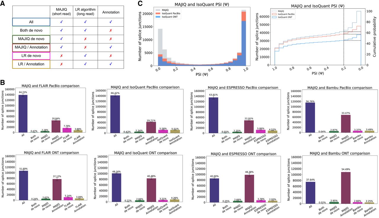
Splice junction comparative analysis. (A) Any detected splice junction can fall into one of six categories, each represented by a color, depending which of the three sources of information (short reads, long reads, annotation) support it. (B) Bar charts corresponding to the aforementioned six categories. Mean and standard error bars are computed using matched data sets from three replicates of human cell-line samples sequenced by LRGASP (Pardo-Palacios et al. 2024). These data include short reads processed by STAR and MAJIQ, long reads from PacBio and ONT assays, and four long-read algorithms used to process the long-read data. (C) Taking the splice junctions reported in B by MAJIQ (green) and assessing the number of those also identified when using PacBio (red) or ONT (blue) long reads, as a function of the PSI values. Here IsoQuant was used for long-read data. Note that if a junction appears in multiple LSVs, the lowest PSI values are chosen (x-axis). The graph on the right is the CDF for the histogram shown on the left. Dashed lines denote splice junctions with a PSI of 20%.


