
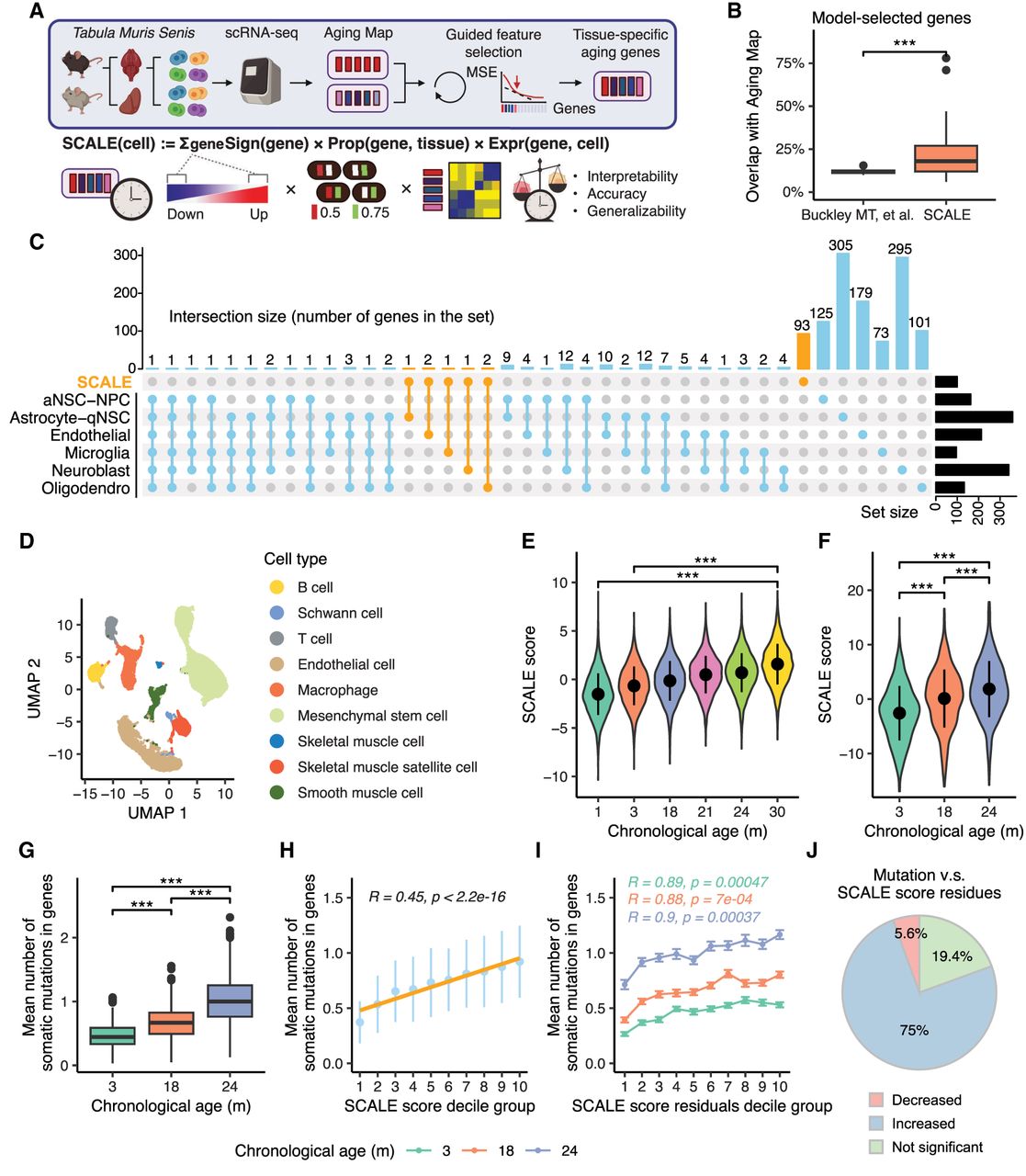
Tissue-specific quantification of aging in single-cell transcriptomic data using knowledge-guided feature selection. (A) Illustration of the SCALE pipeline applied to the Tabula Muris Senis data. (B) Boxplot showing overlaps between genes in Aging Map and aging genes selected by two methods, namely, aging clocks of Buckley et al. (2023) and SCALE. Each data point represents the gene set selected for a particular cell type (Buckley et al. 2023) or tissue (SCALE). (***) P-value < 0.001 using a two-sided unpaired Student's t-test. (C) UpSet plot illustrating the intersection of gene sets used by the six cell type–specific chronological aging clocks of Buckley et al. (2023) and the SCALE brain model. Genes selected by SCALE are highlighted in orange. (D) Uniform manifold approximation and projection (UMAP) plot of all cells in the kidney. Different colors show different cell types. (E) SCALE scores of kidney cells in each age group. Data are presented as the mean ± SD. (***) P-value < 0.001 using a two-sided unpaired Student's t-test. (F) SCALE scores of limb muscle cells in each age group. Data are presented as the mean ± SD. (***) P-value < 0.001 using a two-sided unpaired Student's t-test. (G) Boxplot showing the mutation burden (inferred from full-length scRNA-seq data) of limb muscle cells in each age group. Data are presented as the mean ± SD. (***) P-value < 0.001 using a two-sided unpaired Student's t-test. (H) Relationship between the mean number of somatic mutations in genes and the SCALE score of limb muscle cells. Cells were divided into 10 groups based on their SCALE scores (from low to high) for better visualization. The yellow line shows the linear regression model results fitted to the data with the corresponding R and P-value. Data are presented as the mean ± SD. (I) Relationship between the mean number of somatic mutations in genes and the SCALE score residual (after regressing out chronological age) of limb muscle cells. Cells were divided into 10 groups based on their SCALE score residuals (from low to high) for better visualization. Data are presented as the mean ± SE. R and P-value were calculated by fitting linear regression model for each age group individually. (J) Pie chart showing multitissue, multi–age group correlation analysis results between the mean number of somatic mutations in genes and the SCALE score residual. “Decreased” represents that mutation number significantly decreases with the SCALE score residuals, “Increased” represents that mutation number significantly increases with the SCALE score residuals, and “Not significant” represents that mutation number is not significantly linearly correlated with the SCALE score residuals.


