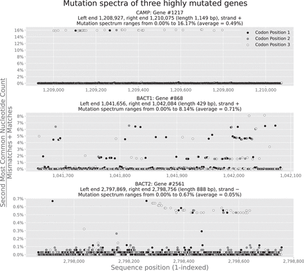
Mutation spectra of highly mutated genes in the three selected MAGs. Each plot shows freq(pos) for every position pos within the selected gene; each of these genes has the highest mutation rate in its parent MAG (for NaiveFreq mutation calls at p = 0.5%) and is thus described in the corresponding MAG's first row in Supplemental Table S2. We exclude deletions from the denominator of freq(pos) (similar to most of the other analyses in this paper), which is responsible for some of the “jumps” in the middle plot (gene 868 in BACT1). Positions are colored by their codon position within the gene, using colors matching those in Figure 3. These figures are analogous to other plots of variation along a gene sequence in the literature, for example Figure 1 in the work by Vasileiadis et al. (2012). Supplemental Figure S14 in the Supplemental Material, “Hotspot genes in the three selected MAGs,” visualizes the coverages of each of these genes.


