
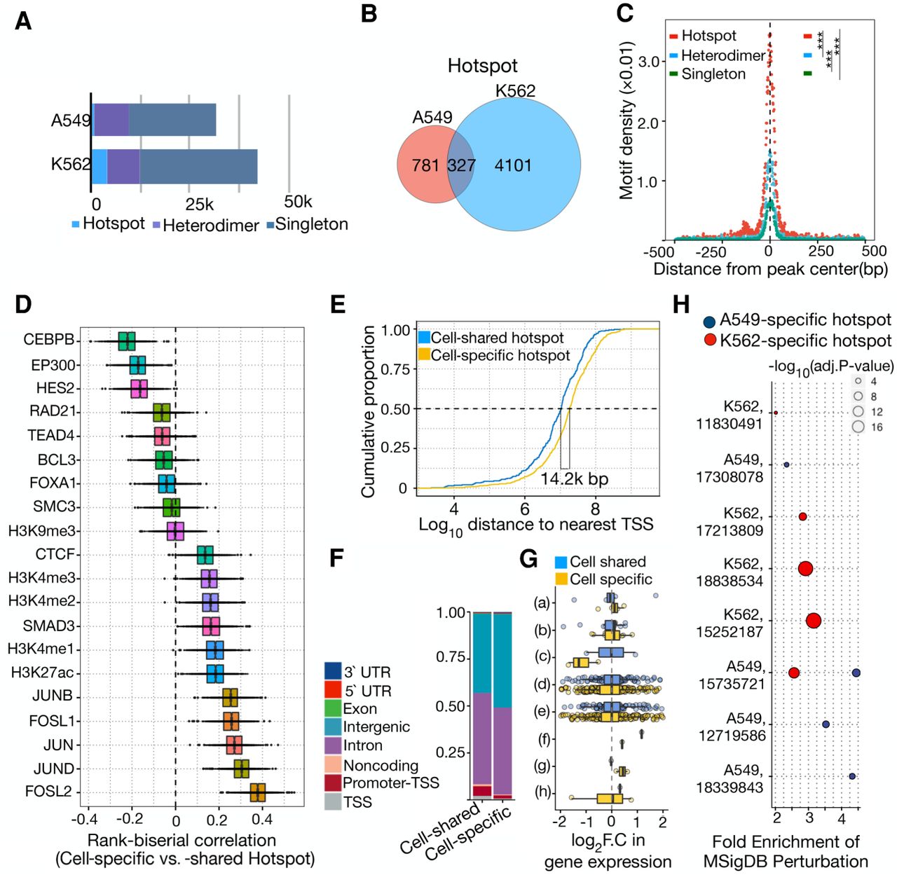
Distinct genomic and regulatory features of cell type–specific AP-1hotspots. (A) Bar plot showing the number of distinct AP-1 binding modes including AP-1 hotspots, AP-1 heterodimer, and singleton in A549 and K562 cells. (B) Venn diagram showing overlap between AP-1 hotspots in A549 and K562. (C) Sitepro plot showing the AP-1 motif per bp per peak for distinct AP-1 binding classes in K562 cells. P-values were calculated using a two-sided Student's t-test based on the normalized motif density within 1 kb of peaks. (***) P < 0.001. (D) Box plots showing the distribution of rank-correlation for TFs and histone marks between cell type–specific and –shared AP-1 hotspots. Each rank-correlation is based on the effect size for the Mann–Whitney U test between size- and number-matched bootstrapped replicates from cell type–specific and –shared AP-1 hotspots for binding activity of TFs. (E) Cumulative distribution of distance to nearest TSS for cell type–specific and –shared AP-1 hotspots. (F) Bar plot displaying the proportion of cell type–specific and –shared AP-1 hotspot loci by genomic annotation. (G) Bar plot showing the distribution of log2 fold change in gene expression in response to dex at a 12-h time point by genomic annotation for pre-established cell type–specific and –shared AP-1 hotspots. y-axis represents genomic annotations: (a) TSS, (b) Promoter-TSS, (c) Noncoding, (d) Intron, (e) Intergenic, (f) Exon, (g) 5′ UTR, and (h) 3′ UTR. (H) MSigDB Perturbation ontology enrichment using the genomic region-based binomial test for cell type–specific AP-1 hotspots in A549 and K562 cells. y-axis shows the cell type used in the perturbation study (Cell type, PubMed PMID for each data set). The color and size of dots represent the cell types and adjusted P-value, respectively.


