
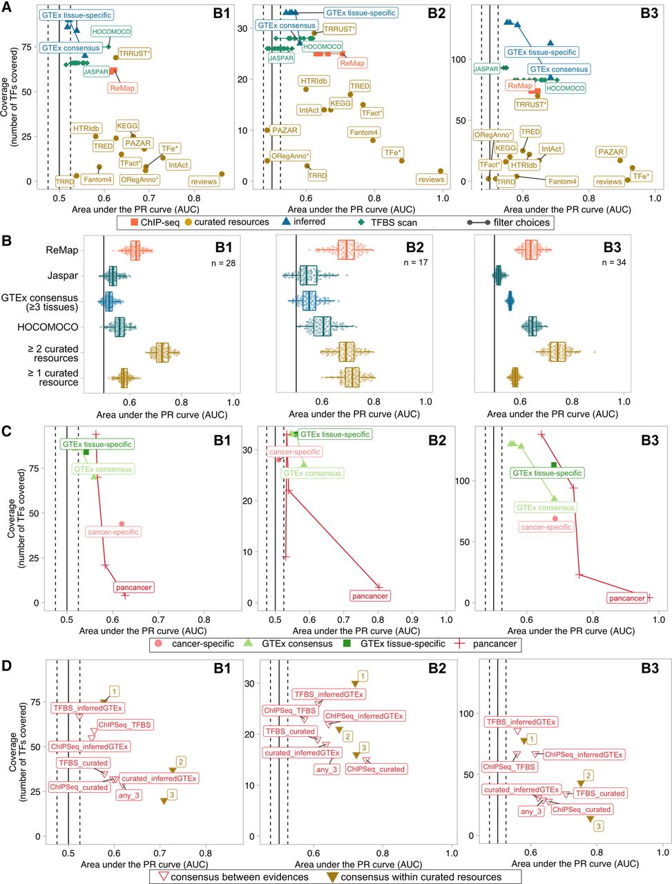
Comparison of TF activity prediction performances by TF–target resource for each benchmark data set. (A) Performance comparison of the regulon data sets, in terms of TF activity prediction, against the three benchmark data sets. Confidence versus coverage plots in which the x-axis represents the average AUPRC from the activity rank's position of the perturbed/essential TF with respect to the negative controls; y-axis represents the number of TFs (with five or more targets) in the benchmark covered by each regulon data set. Dot colors indicate the evidence type (single data sets/evidence). Linked dots represent different filtering strategies in the generation of transcriptionally inferred and TFBS-derived regulons. (B) Performance comparison of the regulon data sets on the overlapping TFs. The x-axis indicates the AUPRC from the activity rank's position of the perturbed/essential TF against the same number of randomly selected negatives; y-axis represents the regulon data set. The number of overlapping TFs is indicated at the top right corner. (C) Similar to A but comparing GTEx-inferred (green) versus TCGA-inferred (red) regulons. Results for both tissue/cancer-specific (dark color) and the respective normal and pancancer consensus regulons (light) are shown. (D) Similar to A but here the regulons are built as a combination of the initial regulon data sets (i.e., TF–target supported by an agreement of two (or three) of any of the four mentioned strategies). Dot colors indicate the nature of the combination (combined evidence). The label accompanying the “consensus within curated resources” dots indicates the number of resources supporting the TF–target interaction.


