
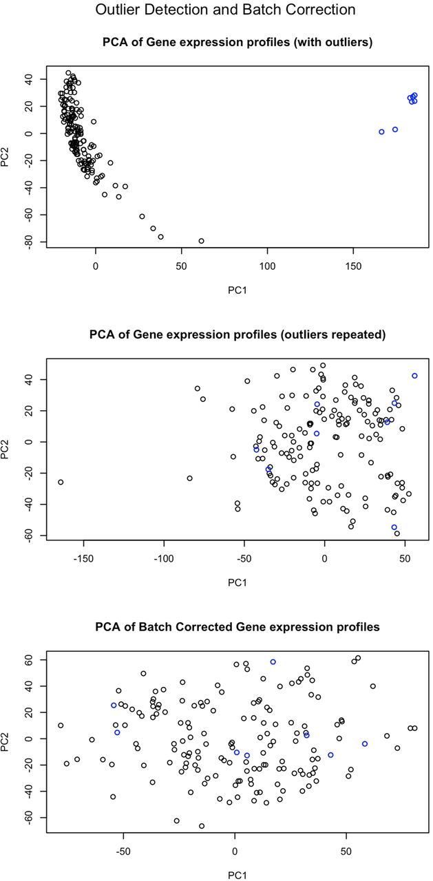
Figure 2.
PCA plots of the expression data with the outliers shown in blue. The top plot shows the separate clustering of these samples, and the other plots show how outliers have been removed and that the repeated experiments have improved quality.


