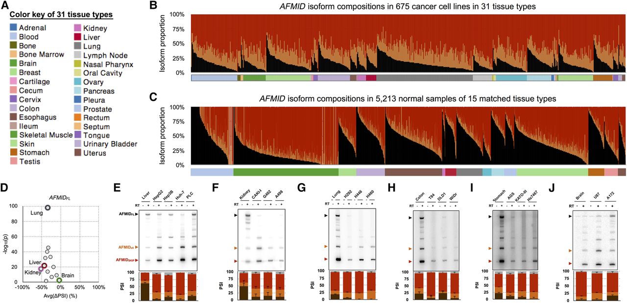
The switch of AFMID isoforms in cancers. (A) The color key of 31 tissue types. (B) The stacked bar chart shows the proportions of AFMID isoforms (AFMIDFL: black, AFMIDSKIP: red, and AFMIDe6: orange) in 675 cancer cell lines, based on RNA-seq analysis. (C) The stacked bar chart shows the proportion of AFMID isoforms in noncancer samples of 15 matched tissue types. (D) The dot plot shows the average ΔPSI between noncancer samples and cancer cell lines from the same tissue type. The x-axis is the average ΔPSI, and the y-axis shows the statistical significance (−log10[P-value]) of the ΔPSI. (E–J) The six panels show radioactive RT-PCR results of AFMID isoforms in normal tissues and cancer cell lines from liver, kidney, lung, colon, stomach, and brain, respectively (24 amplification cycles). The three arrowheads on the left indicate the expected sizes of AFMIDFL, AFMIDe6, and AFMIDSKIP isoforms, respectively. The stacked bar chart below each RT-PCR plot shows the average PSI values and standard deviations from triplicate experiments. The PSI bars of AFMIDFL, AFMIDe6, AFMIDSKIP, and unknown bands are colored in black, orange, red, and gray, respectively.