
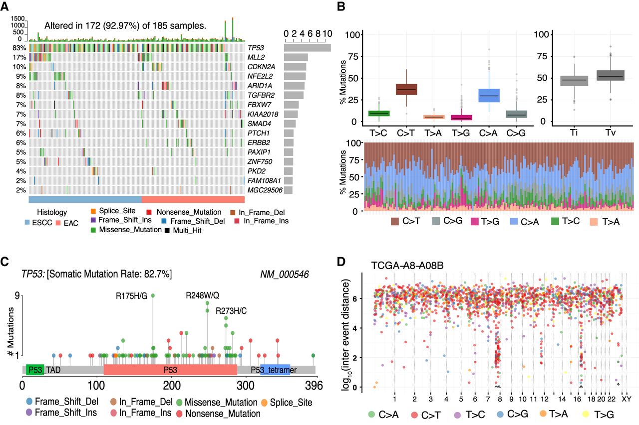
Key plots generated by Maftools visualization module. (A) Oncoplot displaying the somatic landscape of ESCA cohort. Genes are ordered by their mutation frequency, and samples are ordered according to disease histology as indicated by the annotation bar (bottom). Side bar plot shows log10 transformed Q-values estimated by MutSigCV. (B) Transition and transversion plot displaying distribution of SNVs in ESCA classified into six transition and transversion events. Stacked bar plot (bottom) shows distribution of mutation spectra for every sample in the MAF file. (C) Lollipop plot displaying mutation distribution and protein domains for TP53 in ESCA with the labeled recurrent hotspots. Somatic mutation rate and transcript names are indicated by plot title and subtitle, respectively. (D) Rainfall plot for TCGA breast cancer sample TCGA-A8-A08B. Each point is a mutation color coded according to SNV class. Hypermutated genomic segments identified by the change-point method are highlighted by black arrowheads.


