
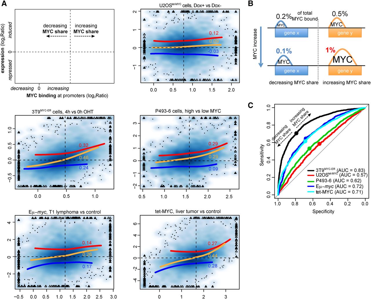
Relationship between MYC binding and gene regulation. (A) Density scatter plots (darker colors for higher density) of the variation of MYC ChIP-seq signal within promoters (x-axis) vs, the corresponding transcriptional variation (total RNA-seq, y-axis). The red, blue, and orange lines capture the trend for induced, repressed, and all genes, respectively. The trend lines are based on local polynomial regression fitting, by excluding data points below the 2nd and above the 98th percentile of MYC binding variation. For the same set of genes, the Spearman correlation is reported. The vertical dashed lines identify, for each system, the amount of MYC change at which promoters begin to increase their share of MYC binding (see panel B). Triangles mark outlier data points (top 0.5% of the data on both the x- and y-axis) that were forced within the plot range limits; the original values for these data points were used to derive the trend lines and correlation values. (B) Schema illustrating the concept of MYC share: despite the overall increase in MYC binding, depicted by the increased peaks area, the proportion of MYC binding out of total MYC-bound (the share, reported as %) could either increase or decrease. (C) Receiver operating characteristic (ROC) curves for the ability of discriminating induced and repressed genes at growing thresholds of changes in MYC binding (see Methods for details). (AUC) Area under the curve. For each system, the dot corresponds to the variation of MYC at which promoters begin increasing their share of MYC binding. These identified the best trade-off between sensitivity and specificity, thus maximizing the ability to simultaneously classify induced and repressed genes.


