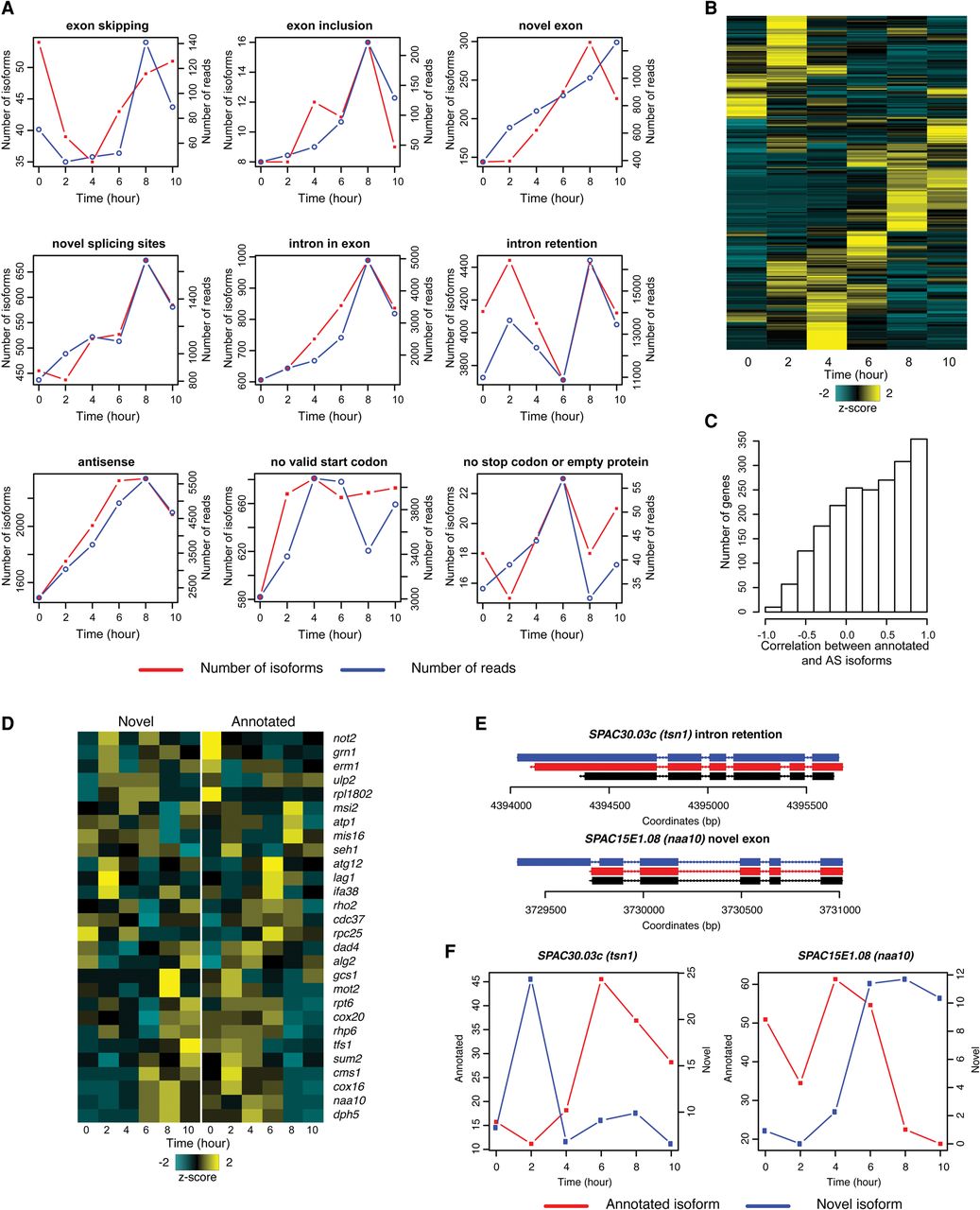
Dynamics of alternative splicing during meiosis. (A) Trends of different types of alternative splicing during meiosis. Red lines represent numbers of isoforms and blue lines represent numbers of FL CCS reads. (B) Heat map showing the temporal pattern of novel isoforms. (C) Histogram showing the correlation between annotated and alternative isoforms during meiosis. (D) Heat map showing the temporal pattern of novel and annotated isoforms. Genes with correlation smaller than −0.4, FL CCS read count > 100, and percentage of annotated isoform < 90% were chosen for hierarchical clustering. (E,F) Examples of anti-correlated isoforms in meiosis. Panel E shows the exon-intron structures of the examples; panel F shows the temporal patterns of the annotated and alternative isoforms.