
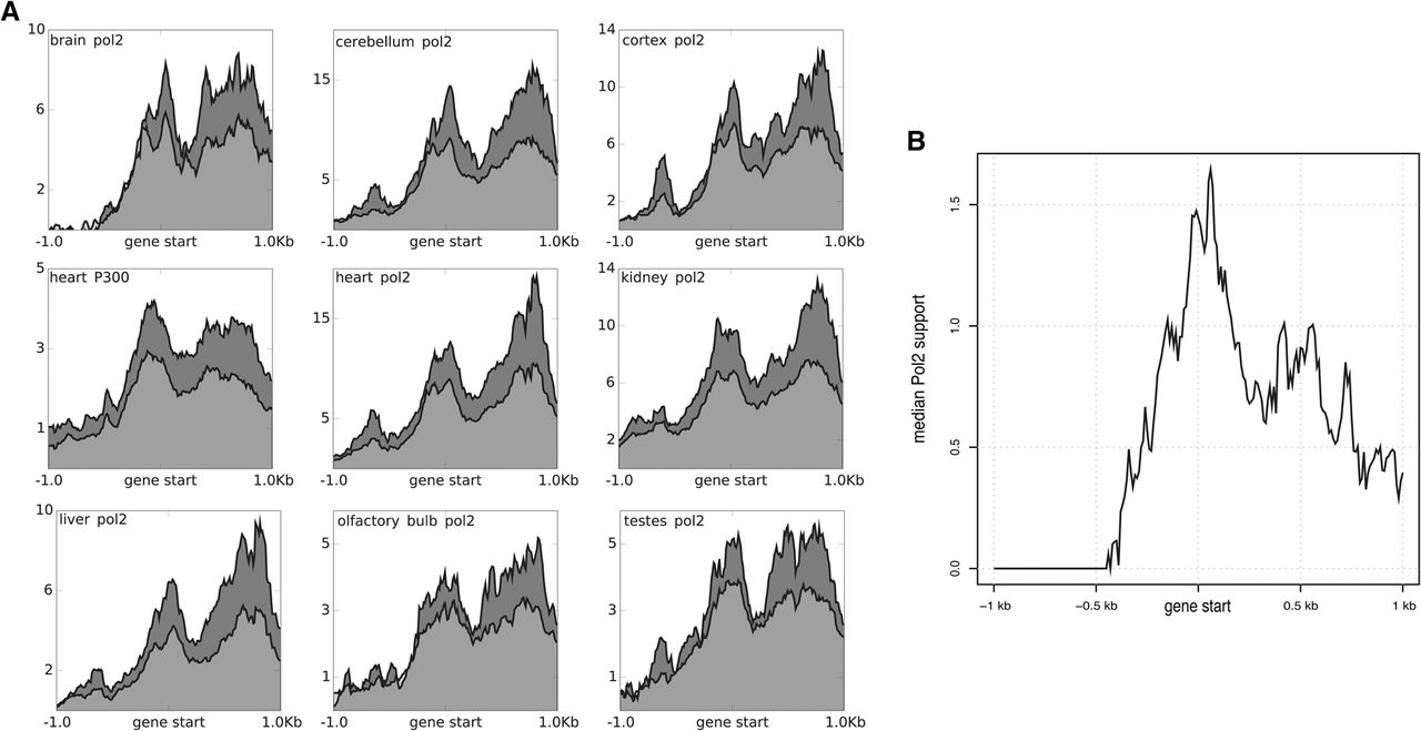
Figure 4.
ChIP-seq support of the new gene starts. Same layout as in the profile of Figure 2C, but in this case, the bins are of 10 bp, the plots are centered on the gene starts, and they show a surrounding area of ±1 kb. (A) The light gray curve represents the mean ChIP-seq support across all the HQ genes. The dark gray curve represents the mean ChIP-seq support across just the HQ genes expressed in that specific tissue (FPKM >5). (B) The curve shows the median ChIP-seq support of the HQ genes in the tissue where they are the most highly expressed.


