
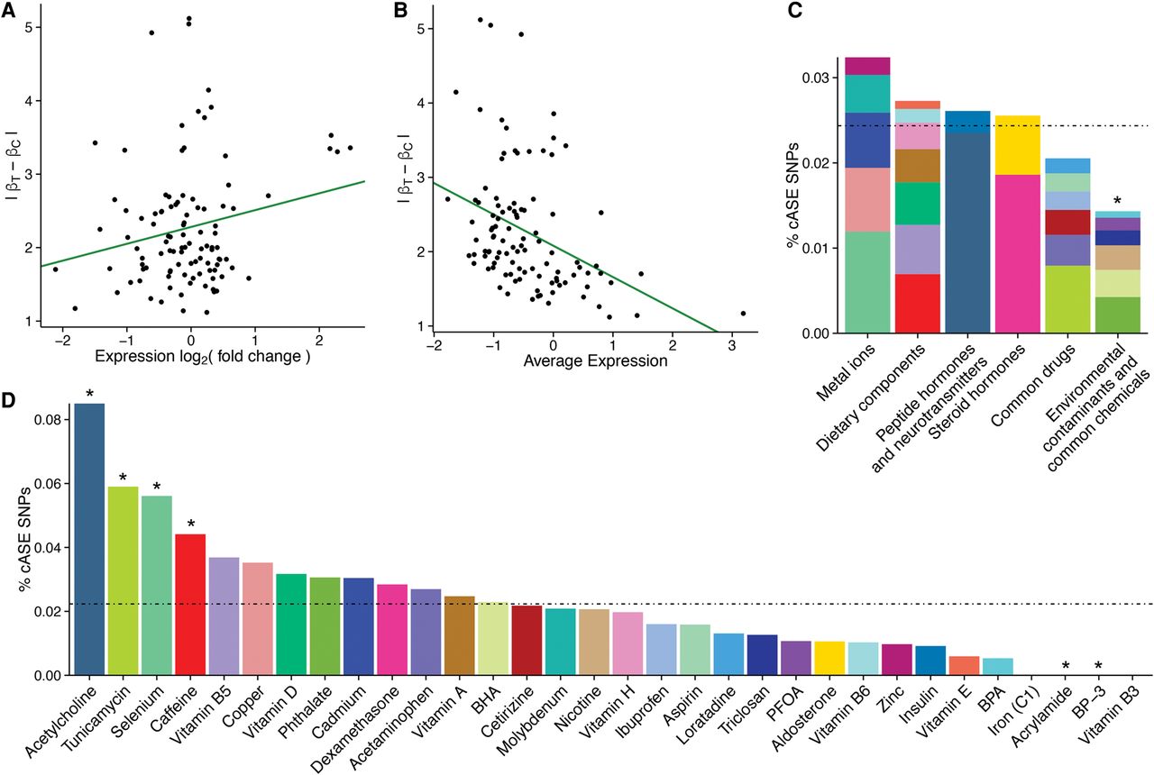
Features of cASE SNPs. (A,B) Scatter plot comparing the absolute difference in ASE  between treatment and control (y-axis) and the average log2 (expression; A) or log2 (fold change; B) between treatment and control samples for cASE SNPs. The green line indicates the trendline from a linear model fit on the
points. (C,D) Percentage of cASE SNPs identified in each treatment category (C) or treatment (D). For each group, plotted is the percentage of cASE SNPs identified, relative to the number of SNPs tested for that group.
The dotted black line represents the average percentage of cASE SNPs across all groups. Groups with an asterisk are significantly
enriched or depleted (binomial P-value <0.05) relative to the average. The colors in C represent the relative proportion of cASE SNPs for each treatment in a treatment category.
between treatment and control (y-axis) and the average log2 (expression; A) or log2 (fold change; B) between treatment and control samples for cASE SNPs. The green line indicates the trendline from a linear model fit on the
points. (C,D) Percentage of cASE SNPs identified in each treatment category (C) or treatment (D). For each group, plotted is the percentage of cASE SNPs identified, relative to the number of SNPs tested for that group.
The dotted black line represents the average percentage of cASE SNPs across all groups. Groups with an asterisk are significantly
enriched or depleted (binomial P-value <0.05) relative to the average. The colors in C represent the relative proportion of cASE SNPs for each treatment in a treatment category.


