
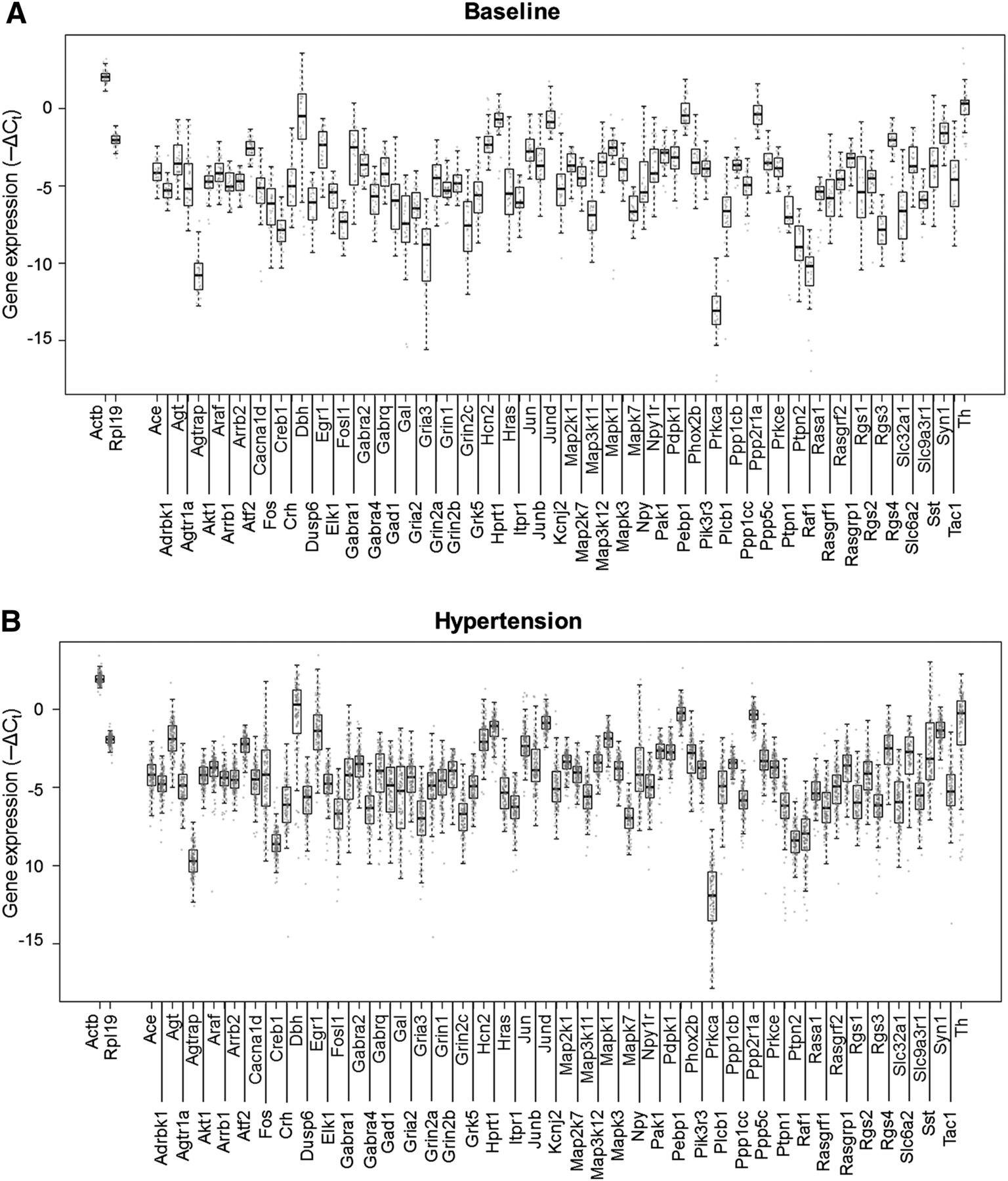
Figure 3.
Gene expression and variance distributions. Boxplots overlaid with in-line scatter plots showing the spread of expression data for all genes (−ΔCt). Each gray dot corresponds to a particular gene expression level in a particular single cell sample. (A) Baseline-normotensive cells. (B) Hypertensive cells.


