
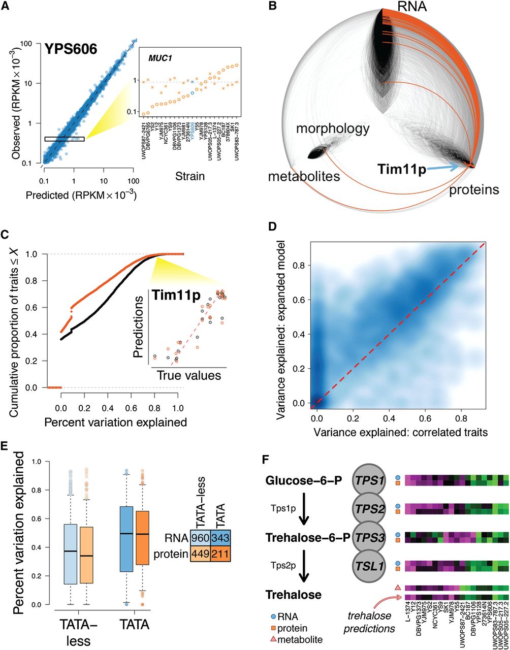
Integrating data to predict phenotypes. (A) Simple models can accurately predict gene expression levels when compared between genes (left, predictions for n = 5385 genes in strain YPS606 are shown), but do not fully capture variation between strains at a specific gene (right inset, gene expression levels for MUC1 are shown for all 22 strains, with YPS606 highlighted in blue; units on y-axis are same as at left). At the MUC1 locus, predicted values (X's) are clustered around the mean expression across strains (gray dotted line), but observed values (circles) diverge substantially. Observed RPKM values have been normalized (Supplemental Note). (B) Hive plot arranged identically to Figure 4A, with orange edges indicating connections to the node representing abundance of the Tim11 protein (blue arrow). (C) Empirical cumulative distribution function (CDF) displaying predictive accuracy for correlation-based phenotype predictions. Black line indicates CDF for predictions made using all phenotypes, and orange line for predictions made using only 1000 tag traits. Inset shows predictions for abundance of the Tim11 protein made using all traits (black dots) and tag traits only (orange dots). (D) Smooth scatter plot comparing performance of prediction models discussed in the text. Darker blue indicates higher density of points, and lighter blue indicates lower density. Dotted red line is drawn at y = x. (E) Boxplot indicating percent variation explained for models of transcript and protein levels. Boxes indicate lower quartile, median, and upper quartile, and whiskers extend to half the interquartile range. (F) Model for predicting levels of the metabolite trehalose, which is synthesized by the trehalose-phosphate synthase complex. Heatmaps show relative levels of transcript, protein, or metabolite, with blue circles, orange squares, and pink triangles distinguishing between data types. Each heatmap is arranged with the strains ordered left to right in the order shown at bottom.


