
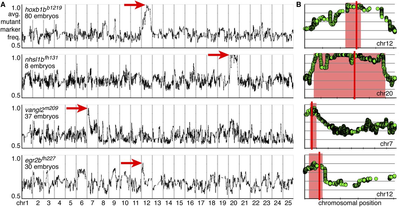
RNA-seq–based mapping identifies single peaks of linkage centered on the known mutations in all experiments. (A,B) Rows represent individual experiments and are labeled by genotype and the number of mutant embryos used for mapping. (A) Genome-wide mapping data. The average frequency of mutant markers (black marks) is plotted against genomic position. In each case, a single region emerges with an allele frequency near one (red arrow). Each chromosome is separated by vertical lines and labeled at the bottom. (B) Detail of the chromosome containing the linked interval for a given experiment (row). The average frequency of mutant markers (green discs) is plotted against chromosomal position. A red box marks each region of linkage, and a red line marks the position of the known mutation. Each tick mark on the x-axis represents 10 Mb. Each y-axis is the same as in A, first row.


