
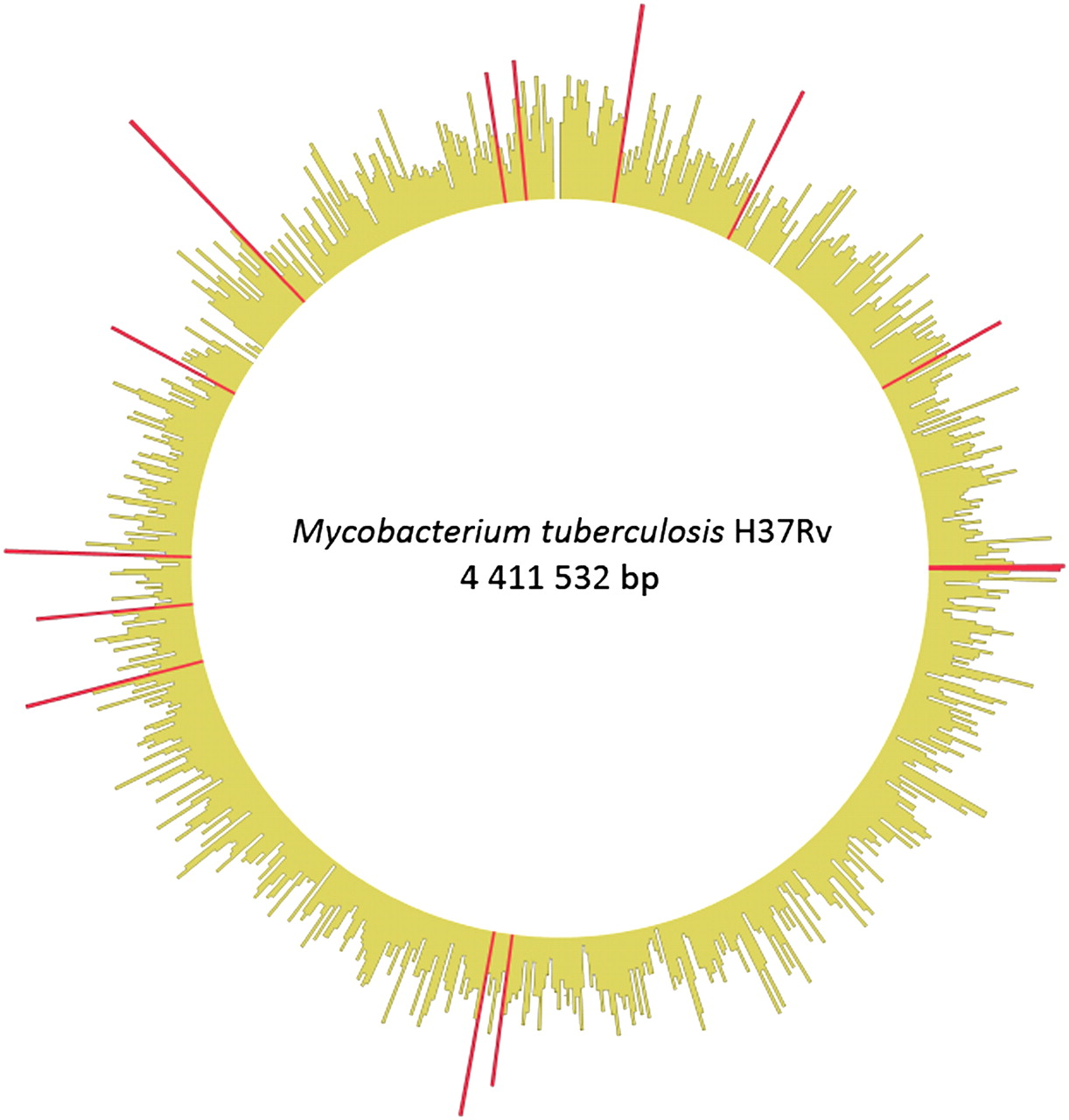
Figure 2.
SNP density map constructed using Circos (Krzywinski et al. 2009). (Yellow bars) The density of SNPs in non-overlapping 5-kb regions. (Red bars) Regions with significantly high SNP density (binomial test, p < 0.05 after sequential Bonferroni correction).


