
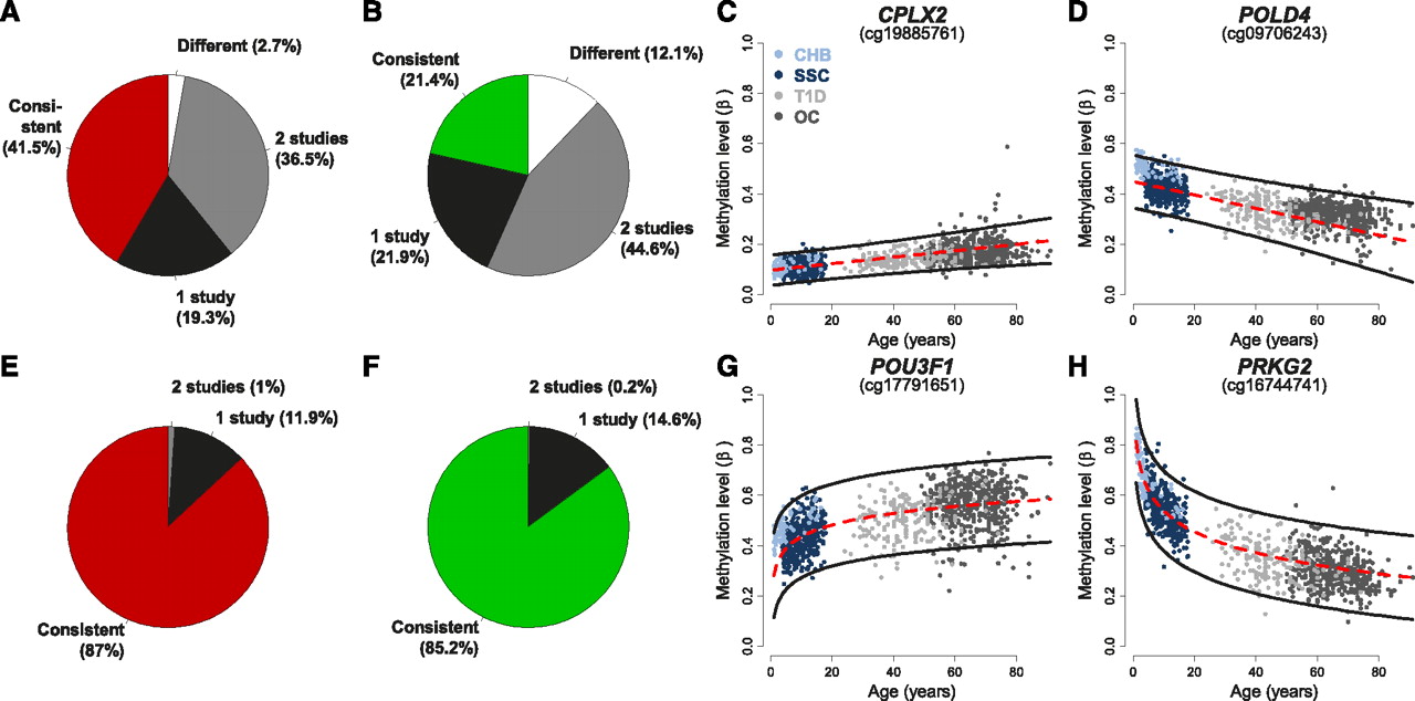
Meta-analysis of pediatric and adult populations: modeling rates of DNAm change via an interaction model. (A,B) Pie charts displaying the proportion of SSC age-methylated (A) and age-demethylated (B) loci that have significantly different rates of DNAm change from the rates found in the CHB, T1D, and OC populations (different: white); in two of these studies (gray); and in one of these studies (black). Loci with similar rates of DNAm change across all four populations are shown in red (A: age-methylated), and green (B: age-demethylated). (C,D) Representative age-methylated (C) and age-demethylated (D) loci that have a similar rate of DNAm change in all populations. (Red dashed line) The linear regression on the SSC data only; (black lines) the 95% predication interval based on this regression. All individuals are denoted by dots and their colors are described in the inset of C. Each plot is titled by the name of the gene associated with the CpG interrogated by the Illumina platform. (E,F) Pie charts similar to those in A and B but modeling the log of age. (G,H) Representative age-methylated (G) and age-demethylated (H) loci that follow a log of age (but not linear) trend in all populations.


