
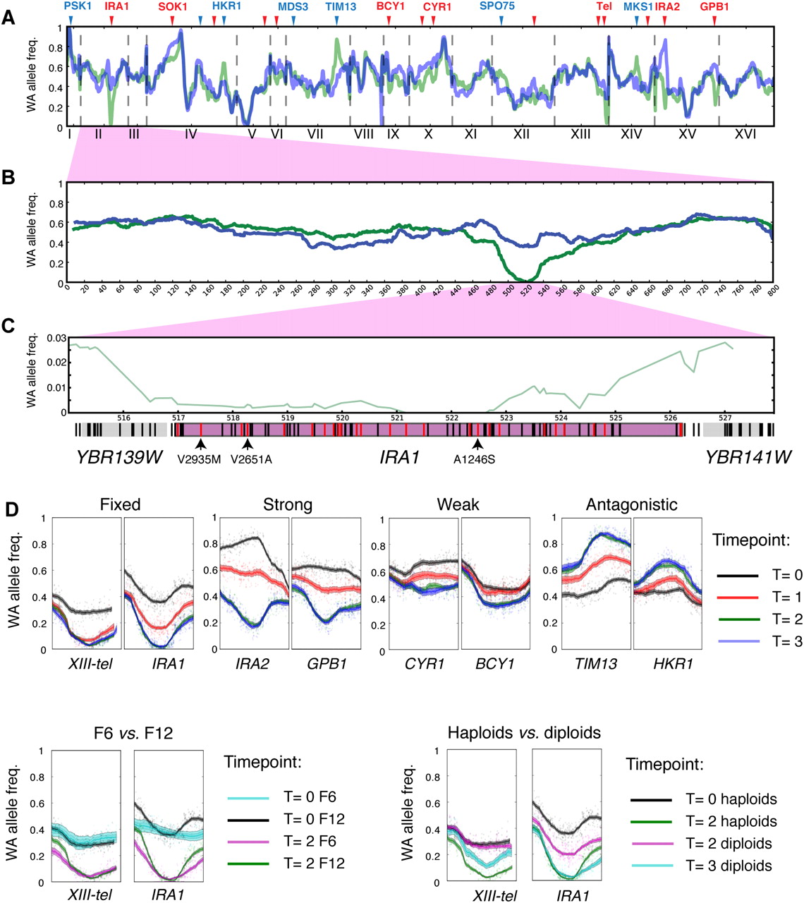
Changes in allele frequencies pinpoint QTLs. (A–C) WA allele frequency of whole genome (A), chromosome II (B), and IRA1 region (C) of the F12 pool before (blue) and after (green) selection. Lines in gene regions in C denote segregating sites (black) and nonsynonymous segregating sites (red). The sites with intolerable mutations determined by SIFT analysis (Supplemental Material SI; Data set S3) are highlighted with arrows and designated with the amino acid change. (D) Individual examples of mapped QTLs that show differences in QTL strength, beneficial allele, effect of intercross rounds, and ploidy. Each window spans 80 kb and is centered on the locus with the largest allele frequency change in F12 T2 across two replicas. Shaded regions indicate 90% and 95% confidence intervals of the allele frequencies (Supplemental Material SI).


