
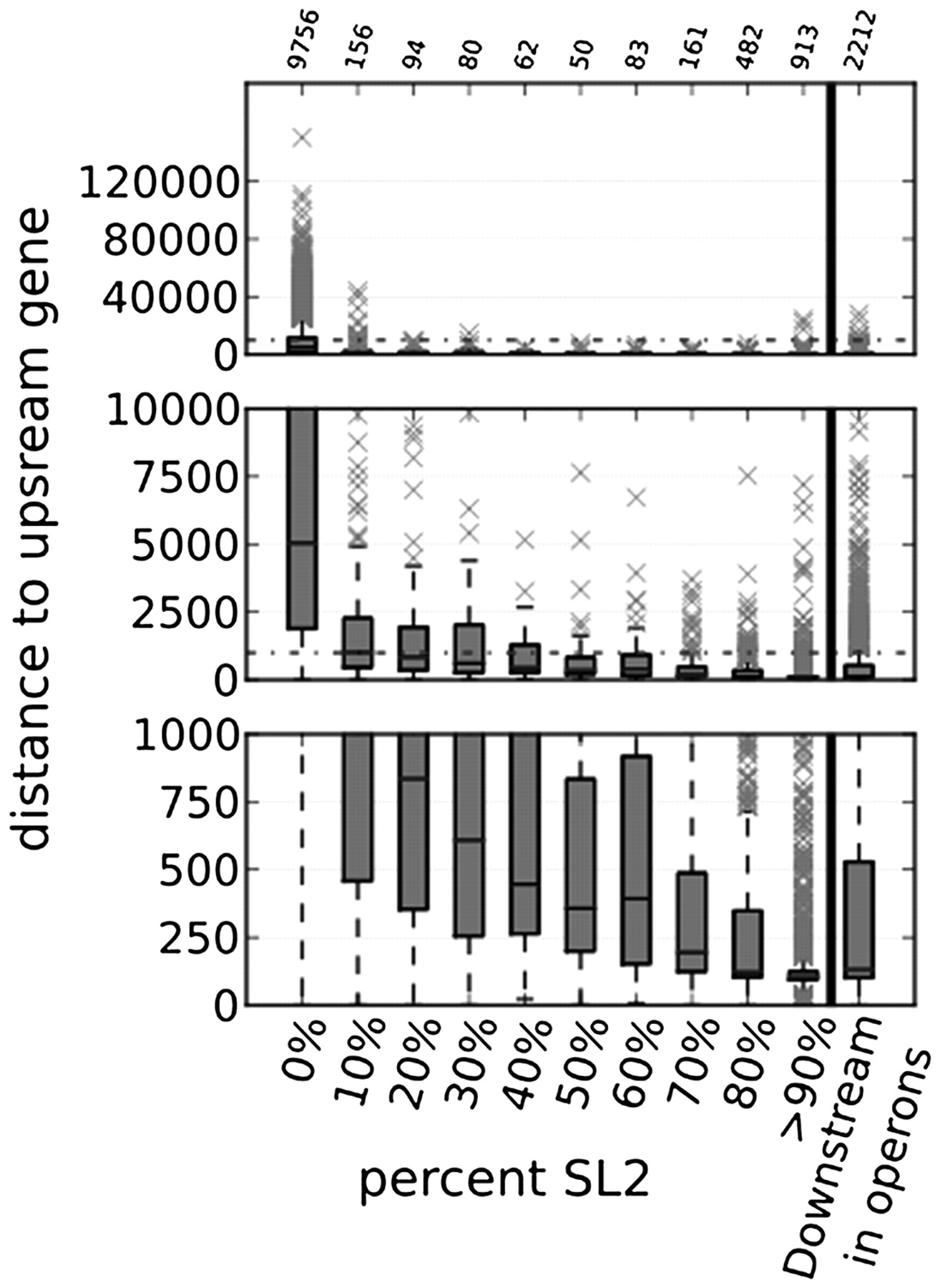
SL2 trans-splicing as a function of distance between genes. Distance between the polyadenylation site of the upstream gene and the trans-splice site of the downstream gene (y-axis) vs. the SL2% of the downstream gene. Box and whiskers plot in which the top of the box equals the first quartile and the bottom is the third quartile. The median value is denoted by a line within the box. The whiskers are 1.5× the inner quartile range. Outliers are represented by ×. All three panels show the same data with progressive magnifications of the lower ranges. The top panel shows all values. The numbers above the top panel are the numbers of genes in each category. The dotted line denotes the maximum value of the middle panel, in which only values below 10,000 are plotted. Similarly, the bottom shows only values below 1000. On the right, the data for all downstream operon genes are shown.


