
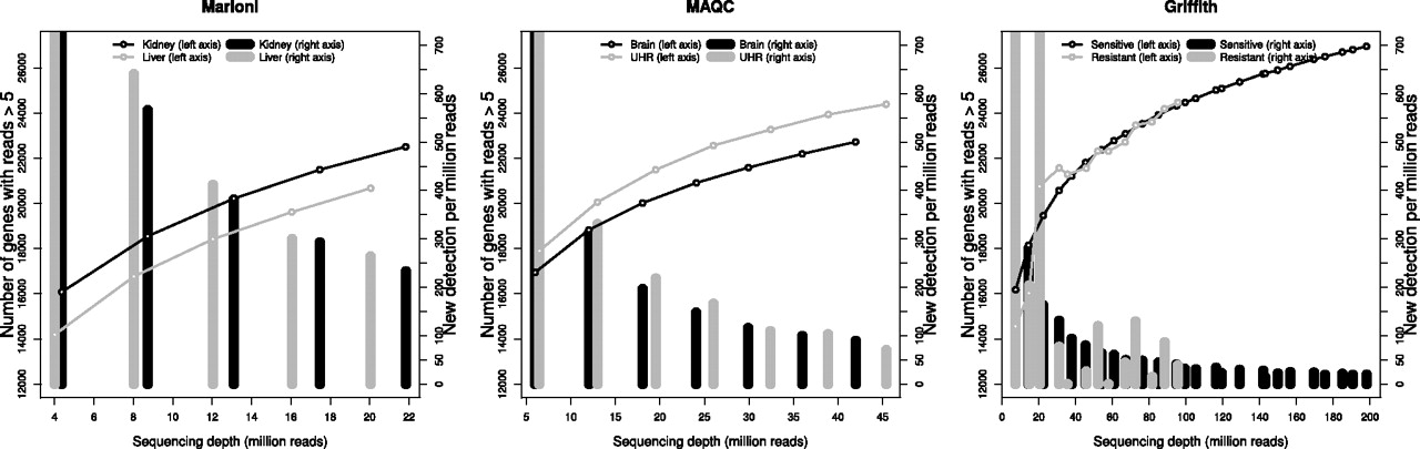
Figure 1.
Saturation curves display the number of genes detected by more than five uniquely mapped reads as a function of the sequencing depth for each experimental condition in the three data sets (left y-axis). Vertical bars represent the number of newly detected genes per million additional reads (NDR, right y-axis) for each experimental condition.


