
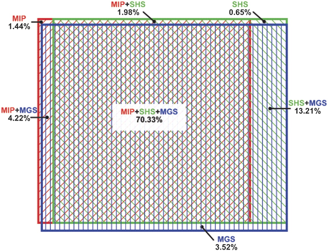
Figure 4.
ROI regions with genotype assignments. The Venn diagram of overlapping genotype coverage is area proportional. Colored rectangles identify the proportion of genotype assignments in the ROI for each method: (red) MIP; (green) SHS; (blue) MGS. Note that the greatest overlap is among all three methods, and the second greatest is between SHS and MGS. The numbers sum to 95.35% because 4.65% of the ROI was not assigned a genotype in any method.


