
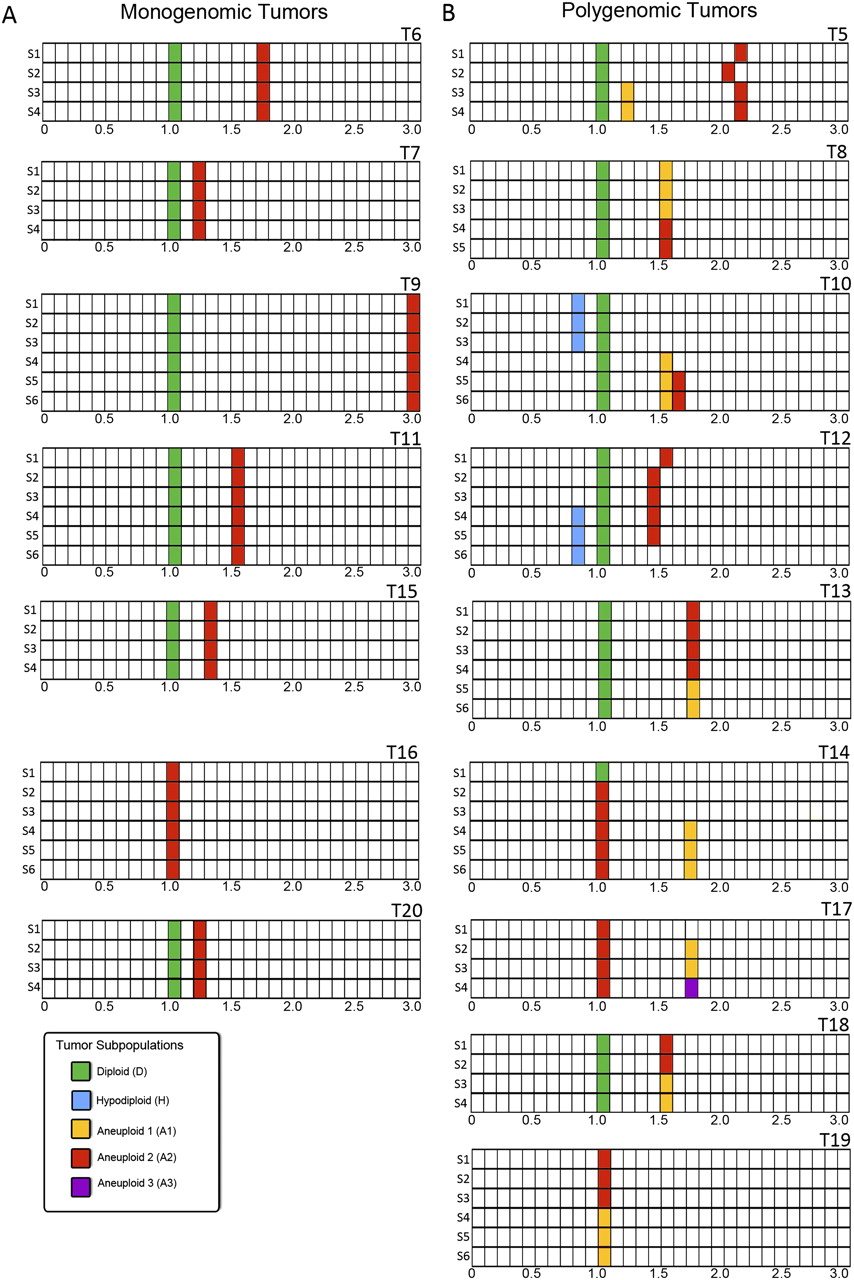
Summary of Sector-Ploidy-Profiling (SPP) results for tumors T5–T20. (A) Monogenomic tumors. (B) Polygenomic tumors. Tumors were cut into four to six sectors. Nuclei were isolated from each sector and sorted by FACS according to differences in total genomic DNA content. DNA content is plotted on the x-axis (calibrated with a normal diploid control with a DNA index 1.0). Tumor sectors are plotted on the y-axis (S1–S6). Filled blocks indicate FACS peaks. Colors represent different subpopulations as distinguished by their CGH profiles: (blue) hypodiploid; (green) normal diploid; (orange, red, purple) distinguishable aneuploid tumor subpopulations. The total number of colors used in the schematic of a given tumor is the same as the total number of subpopulations distinguished in that tumor. For example, tumor T12 contains four subpopulations: one diploid subpopulations present in all sectors, one hypodiploid subpopulation present only in sectors 1–3, one aneuploid subpopulation present only in sectors 4–6, and a second aneuploid subpopulation present only in sectors 5–6.


