
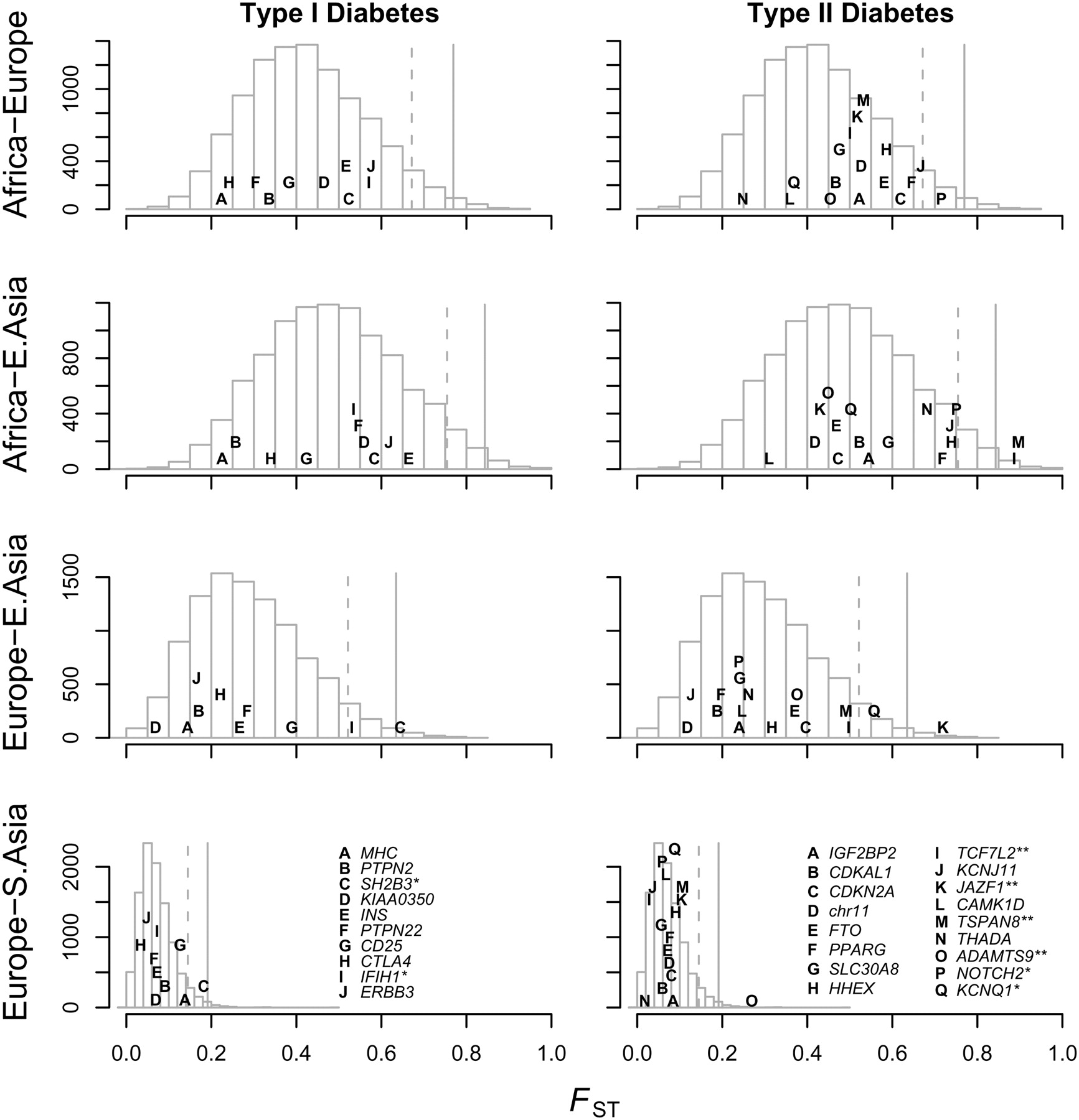
FST around loci involved in natural variation in diabetes susceptibility. For each SNP associated with either type I or type II diabetes we plot the maximum pairwise FST between geographic regions in a 100-kb window surrounding the SNP in the HGDP data, as well as a histogram of the null distribution calculated by finding the maximum FST in 100-kb windows surrounding each of 10,000 random SNPs. The dotted lines shows the position beyond which 5% of the random SNPs fall, and the solid lines the position beyond which 1% of the random SNPs fall. Gene names that are starred fall in the 5% tail of at least one comparison, and those with two stars fall in the 1% tail of at least one comparison. Letters are positioned along the y-axis to improve readability. The key in the bottom panel of each column applies to the entire column.


