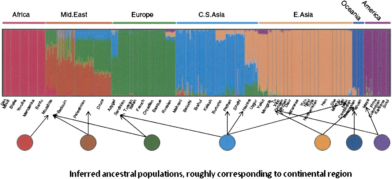
Admixture structure analysis of a worldwide sample. The x-axis represents individuals from populations arrayed geographically roughly from west to east, as labeled above with sample sources identified below. There is a thin vertical bar for each individual, color-coded to represent his/her admixture proportions from “parental” populations. The parentals are shown schematically as circles below the diagram, with arrows indicating a few of their contributions to individuals in the sample (circles and arrows added by us for this paper). These parental representations are not part of the actual sample but are statistically abstracted from it, as if they actually exist (some individuals in some of the populations are statistically assigned 100% ancestry from one of the parental in this particular data set). This analysis was done using the structure-like program Frappe (that employs a different estimation procedure for similar objectives; Tang et al. 2005). Structure analysis figure reprinted with permission from Li et al. 2008, American Association for the Advancement of Science © 2008.