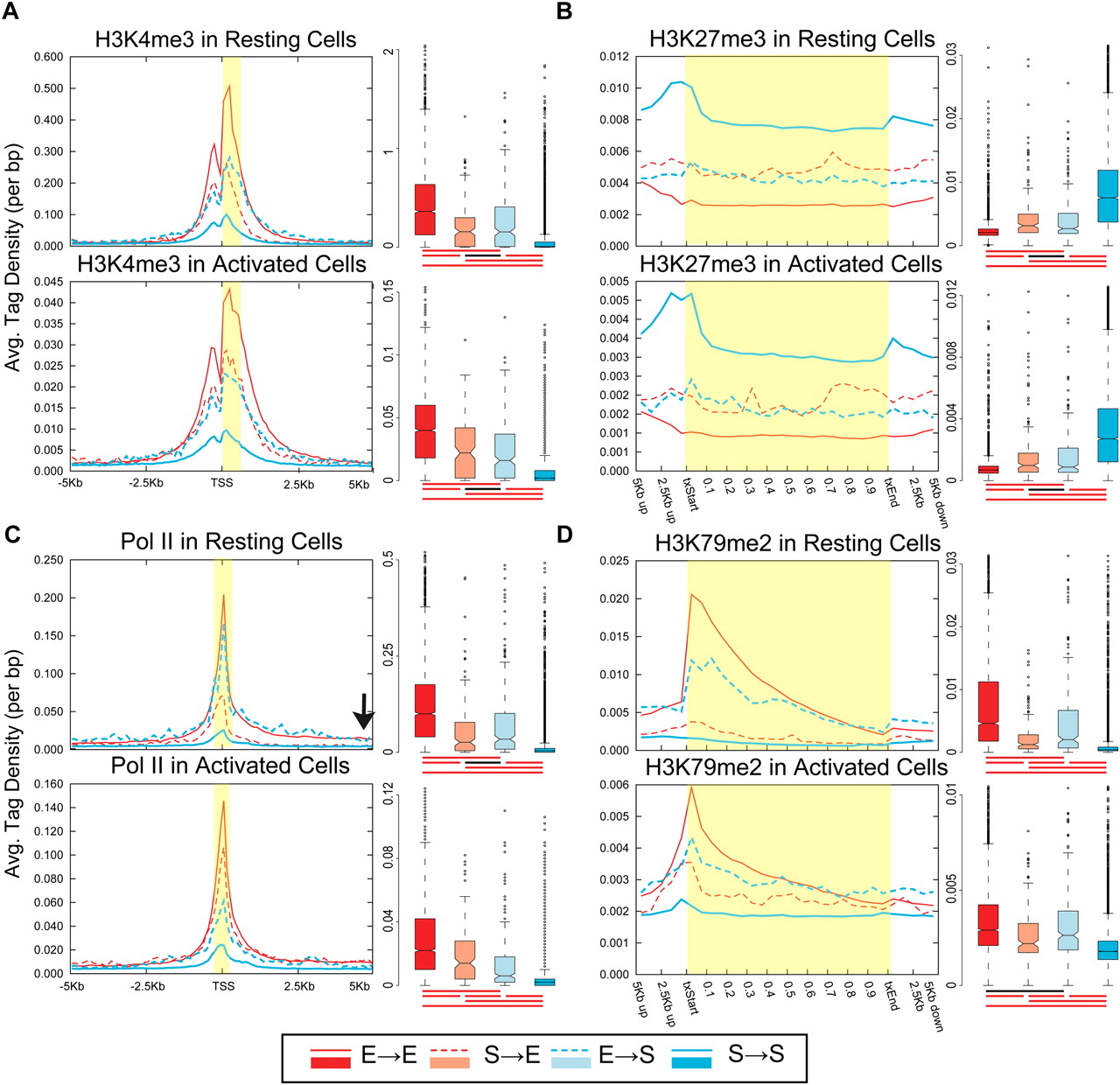
A majority of the genes do not change their chromatin status upon induction or silencing. Average ChIP-seq tag density for the four gene sets are shown in resting (top panel) and activated (bottom panel) CD4+ T cells. The four gene sets: S→E (silent in resting and expressed in activated T cells), red dashed line in density plot and light red in box plot; E→S, blue dashed line and light blue; E→E, red line and red; S→S, blue line and blue. The average tag density values for resting and activated cells are not directly comparable as they have not been normalized across samples. Box plot summarizes the distribution of the number of tags in the region of interest (highlighted in yellow) for each gene set. Box plot captures the median, the middle 50% of the data points, and the outliers. The data points for each gene set are divided into quartiles, and the interquartile range (IQR) is calculated as the difference between the first and the third quartiles. The filled box denotes the middle 50% of the data points, with the horizontal line in-between and the notch representing the median and confidence intervals, respectively. Data points more than 1.5 times IQR lower or higher than first or third quartiles, respectively, represent outliers and are shown as dots. The horizontal line connected by vertical dashed lines above and below the filled box (whiskers) represents the largest and the smallest nonoutlier data points. The cluster of horizontal red and black lines below each box plot signifies whether or not the difference between the medians of two gene sets are statistically significant, respectively (P < 0.01; two-tailed Wilcoxon rank-sum test). (A) H3K4me3, (B) H3K27me3, (C) Pol II, and (D) H3K79me2. Profiles for other modifications are presented in Supplemental Figures S3 and S4.