
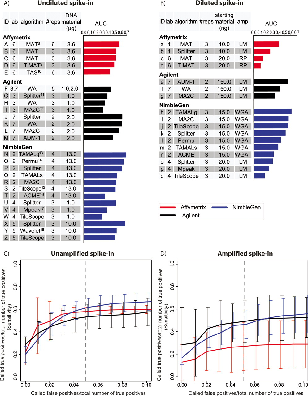
Summary performance statistics for spike-in predictions. (A) Undiluted and Unamplified samples. Raw data were provided by seven different labs, which are designated as follows: (1) M. Brown; (2) P. Farnham and R. Green; (3) R. Myers; (4) B. Ren; (5) M. Snyder; (6) K. Struhl and T. Gingeras; (7) S. McCuine. AUC (Area Under ROC-like Curve) values were calculated based on the ranked list of spike-in calls provided by each group. The references for the algorithms are: (8) Johnson et al. 2006; (9) D. Nix, http://sourceforge.net/projects/timat2; (10) Cawley et al. 2004; (11) H. Shulha, Y. Fu, and Z. Weng, http://zlab.bu.edu/splitter; (12) Song et al. 2007; (13) Bieda et al. 2005; (14) Lucas et al. 2007; (15) Zhang et al. 2007; (16) Scacheri et al. 2006; (17) Kim et al. 2005; (18) A. Karpikov and M. Gerstein, unpubl. (B) The same as A, for Diluted and Amplified samples. (C) ROC-like plots for Unamplified spike-in predictions. As an aid in interpretation, the dashed vertical line represents the point at which a group’s number of false-positive predictions equal 5% of the total number of true-positive spike-ins. At this point, all platforms correctly identified ∼50% of the true-positive spike-ins. Error bars represent the two-sided 95% confidence interval of the average sensitivity at each false-positive ratio (X-axis). (D) The same as C, for Amplified samples.


