
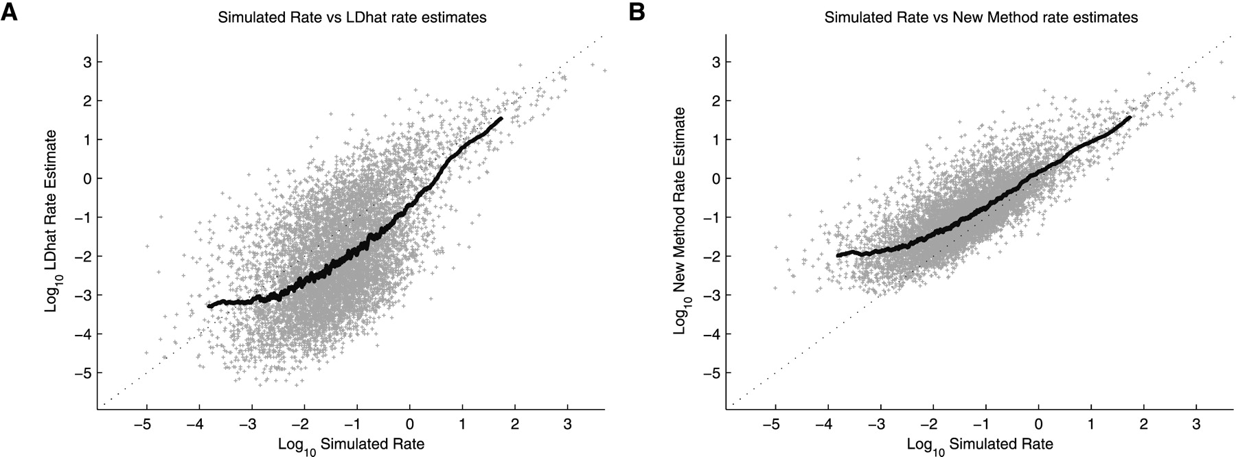
Figure 4.
Results from Simulation Study B. Scatter plot of simulated rate versus estimated rate for LDhat (A) and rhomap (B). Each point represents an estimate of recombination rate between two adjacent SNPs. A 250-point moving average is also shown.


