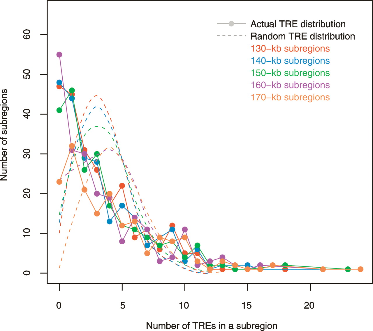
Figure 3.
TRE distribution in ENCODE regions. Colors signify different genomic subregion sizes. The dots in the same color represent the actual TRE distribution with a particular subregion size. Given the number of TREs in a genomic bin, each dot marks how many such bins are in the ENCODE regions. The null distributions of randomized TREs are represented by dashed curves. Notice both the actual and the null distributions change only slightly when the genomic bin size varies.