
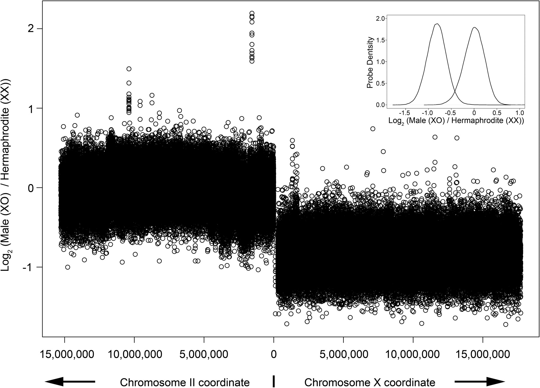
Figure 3.
Comparison of the normalized average fluorescence ratios (XO male/XX hermaphrodite) for all probe pairs to chromosomes II and X. The graph in the top right corner plots the probe density versus the log2 fluorescence ratio for probes to chromosomes II and X. The curve peaking on the left is for the X chromosome and the curve peaking on the right is for chromosome II. The distributions overlap by ∼4%.


