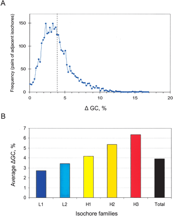
Figure 3.
ΔGC distribution of adjacent isochores. (A) The frequency plot shows the jumps in GC between adjacent isochores identified, in intervals of 0.2% GC. The mean difference is 3.9% GC (dashed line), and 82% of the differences between neighboring isochores are above 2% GC. (B) The bar plot shows the average ΔGC concerning isochores from each of the five families.


