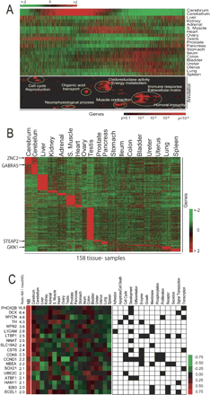
(A) Gene Ontology densities on reshuffled data. The upper heat map represents the average gene expression in 19 tissues. The genes were ordered by the reshuffling algorithm and analyzed for regions where the density of genes annotated to GO terms was higher than expected by random chance. The results of this analysis are shown in lower heat map, where the probability of finding a GO term by chance represented by a red color according to the scale shown. A red color thus represents a nonrandom density of genes associated with the corresponding GO term around this position (x-direction) in the gene list. The GO terms (y-direction) were selected if at some location the density genes annotated with the corresponding GO terms was considered statistically significantly overrepresented. The selected 98 GO terms were then sorted in the y-direction by HC with respect to the pattern of P values. A detailed list of the GO terms is given in Supplemental Table We have highlighted in white ellipses some of the most predominant terms. (B) Organ-specific gene expression. Heat map of the expression level of all samples for 4291 organ-specific genes identified by performing pairwise t-tests between each organ and all the remaining organs. (C Neuroblastoma-specific gene expression. (Left panel) The heat map the median values for gene expression for the differentially expressed genes in NB and each of the normal organs. The color scale represents the z-scored gene expression ratio (number of standard deviation of median expression ratio from the mean). (Right panel) The GO terms the 19 genes, where a black square in the grid indicates that the gene associated to that GO term. The numbers in the NB/max(NS) column the ratios of the median NB gene expression ratio divided by the maximum median expression ratio of all 19 organs.


