
Figure 3.
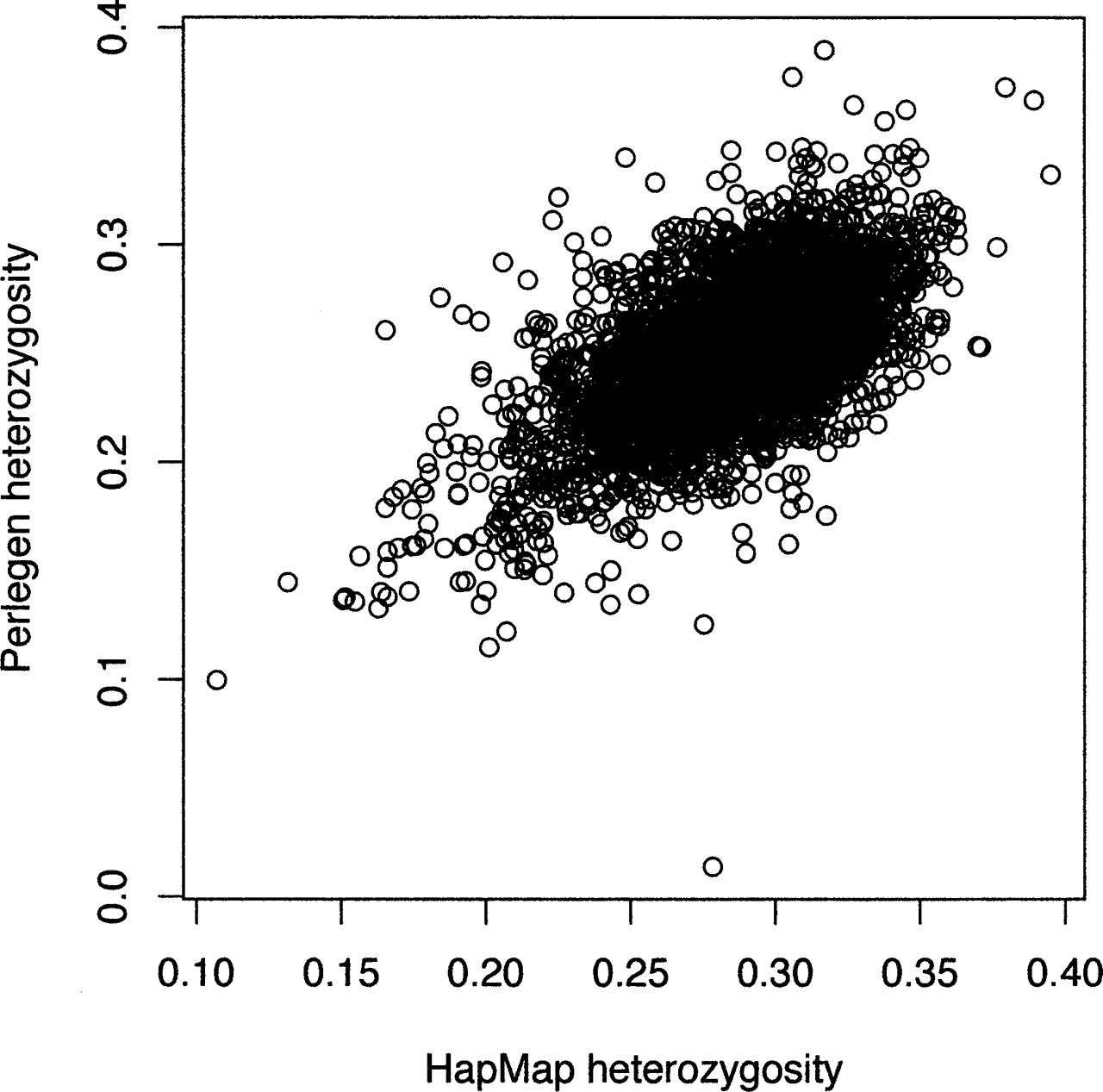
Scatterplot of uncorrected HT for the HapMap data (x-axis) and the Perlegen data (y-axis). Each circle represents a 500-kb window, and the plot depicts the entire HapMap and Perlegen genome-wide samples.
(Downloading may take up to 30 seconds. If the slide opens in your browser, select File -> Save As to save it.)
Click on image to view larger version.
Scatterplot of uncorrected HT for the HapMap data (x-axis) and the Perlegen data (y-axis). Each circle represents a 500-kb window, and the plot depicts the entire HapMap and Perlegen genome-wide samples.
 CiteULike
 Delicious
 Digg
Digg Facebook
 Google+
 Reddit
 Twitter
