
Figure 1
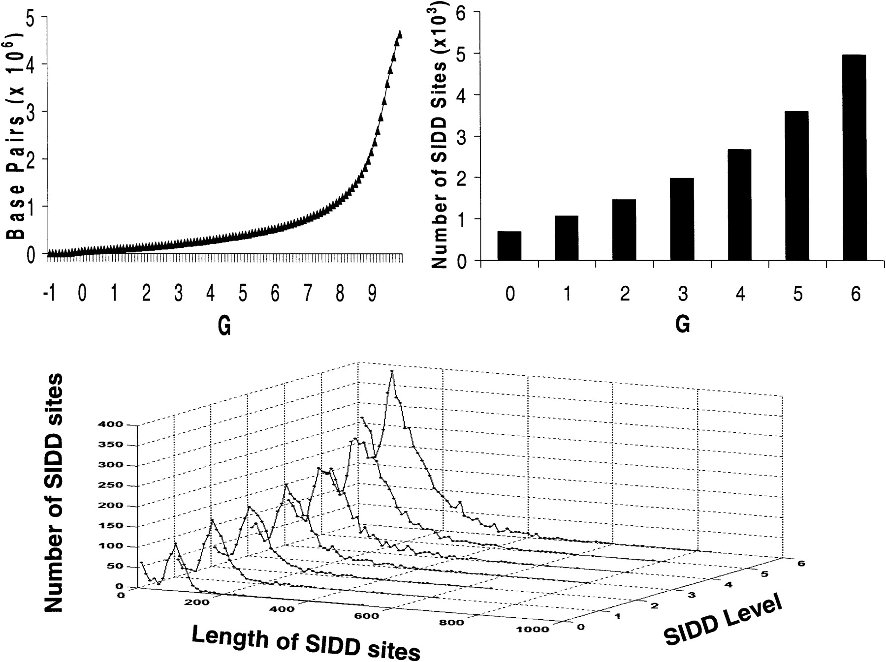
The top left graph plots the cumulative G(x) distribution. For each value of G on the horizontal axis, the curve plots the number of base pairs destabilized below that value, that is, G(x) ≤ G. The top right graph shows the number of SIDD regions (sets of consecutive base pairs, all of which are) destabilized below the indicated level. The graph on the bottom shows the distributions of lengths of these SIDD regions.


