
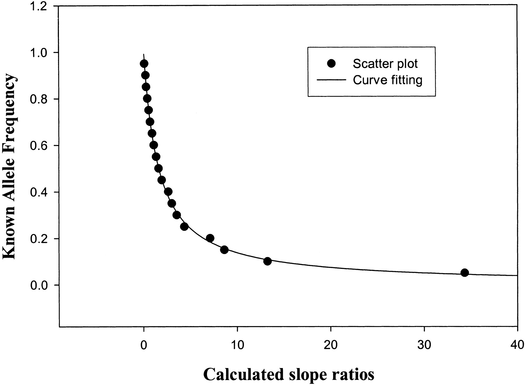
Figure 4.
The plot of slope ratio vs. allele frequency using data in Table 1. The scatterplot is the slope ratio vs. known allele frequency. The curve fitting is with the hyperbolic equation y = a/(1 + bX) with a and b being 1.02 (P < 0.0001) and 0.66 (P < 0.0001), respectively, which agrees well with predicted values of 1 and 0.67.


