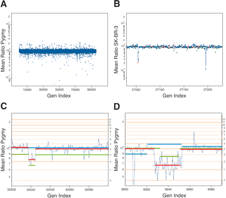
(A) The results of a normal genomic profile compared with a normal, identical to that displayed in Figure 2C2 with the exception that singlet probes have been filtered as described in the text. (B) The serial comparison of experiments for a small region from Chromosome 4. The Y-axis is the mean ratio in log scale. The X-axis is the genomic index, as described. The blue (85K) and red (10K) spots are from the comparison of SK-BR-3 to normal. The green is a comparison of a pygmy to the normal reference. (C) A lesion found in the normal population on Chromosome 6. The blue spots are plotted by mean ratio for analysis of the pygmy to the normal reference. The red line is the mean-segment value for the pygmy-to-normal reference comparison. The green line is the mean-segment value for the SK-BR-3-to-normal reference comparison. The blue line is the segment value from the primary tumor (CHTN159 aneuploid to diploid) comparison. (D) A region of Chromosome 2. The data shown in blue circles are from the comparison of SK-BR-3 to the normal reference. The mean-segment line for this comparison is shown in green. The mean-segment line for the comparison of a pygmy to the normal reference is shown in red and for the primary tumor CHTN159 in blue. For C and D, the calculated copy number for the horizontal lines is found to the right of the panel.


