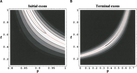
Figure 5.
Contour plots of the posterior distribution of f, the frequency of using an alternative transcription start (A) or polyadenylation (B) site, and p, the frequency of type A and type B variants (see text) generated. The maximum likelihood solutions are shown in red lines. The contours are drawn at 0.95, 0.75, 0.5, 0.25, 0.1, and 0.05 of the maximum-likelihood value.


