
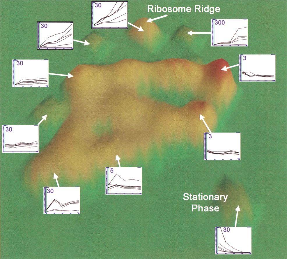
Figure 2.
VxInsight-generated ordination of exit from stationary-phase data set. Examples of gene expression within each hill or cluster are shown. Along the x-axis of insert graphs are time points (0, 15, 30, 45, and 60 min) after re-feeding. The y-axis of insert graphs indicates the fold-increase or decrease from time equals; 0, which is an average of four to five replicates for each time point. Numbers in the insert graphs indicate the maximum value of the y-axis, which indicates relative expression values obtained using GeneSpring (Silicon Genetics; see Methods). Data were generated as described (Methods).


