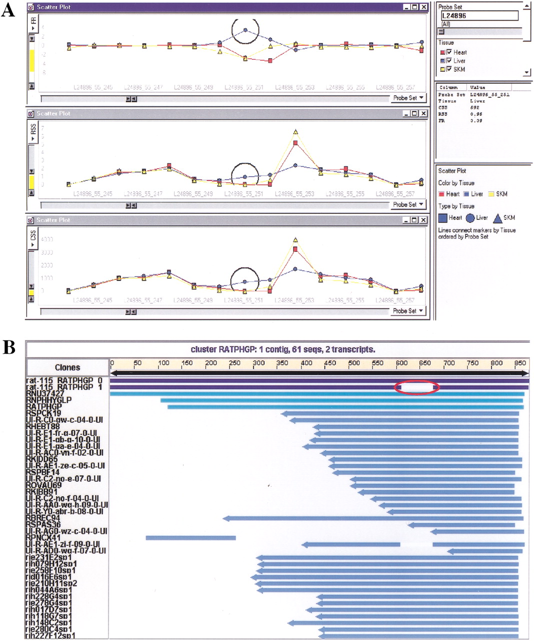
Example of data visualization and validation. (A) Data visualization in Spotfire. Data tables (CSS, RSS, FR) generated from the analysis was pivoted, imported into Spotfire Pro and visualized by 2-D line graphs. The X-axis represent the sequential order of probe pairs on a transcript and theY-axis represent CSS, RSS, and FR values in each separate panel, respectively. As an example, L24896 is the probe set shown in the figure. Line connections in the graphs are based on tissue types and separately colored. Candidate probes detecting potential tissue-specific splice variants are represented by the gap region in FR panel. (B) Data validation of Compugen LEADSsearch result. Candidate probe sequences from probe set L24896 were mapped to the rat EST cluster (NCBI release 115). EST clusters were generated by LEADS. Two major alternative transcripts are shown at the top of the cluster RATPHGP. The alternative splicing region is indicated in the second transcript by the gap.