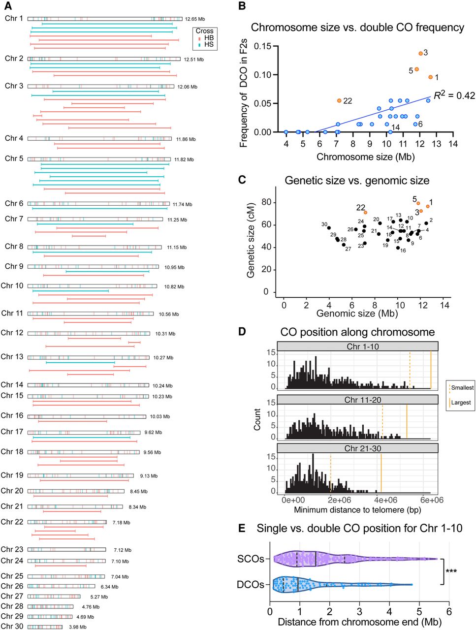
CO distribution in Plodia. (A) CO positions for F2 progeny, in which each chromosome is shown separately. Observed SCOs are shown at the top in the chromosome-scale box, and DCOs (when observed) are shown below. Each end of a horizontal line represents the position of one of the two COs in a DCO chromatid. COs from WT Savannah backcrosses are shown in blue, and COs from WT bFog backcrosses are shown in red. (B) Scatter plot showing correlation analysis for chromosome size (x-axis) versus DCO frequency (y-axis) from the F2 hybrids. A single blue or orange dot represents each chromosome. Orange dots are outliers above the line of best fit. Linear regression was used to calculate the line of best fit, R2. (C) Scatter plot showing physical genomic size of individual chromosomes (x-axis) versus genetic size in centimorgan calculated based on F2 data (y-axis). Orange dots are the outliers from B. (D) Histogram showing the minimum distance of a CO from the end of a chromosome, in which the number of COs for each chromosome are binned using 30 kb windows. The genome was subdivided into three chromosome-sized groups, with Chr 1–10 (largest; 12.65–10.82 Mb) shown at the top, Chr 11–20 (10.56–8.45 Mb) shown in the middle, and Chr 21–30 (smallest; 8.34–3.98 Mb) shown at the bottom. Dashed orange lines show the mid-point of the smallest chromosome per chromosome group, and solid orange lines show the mid-point of the largest chromosome per chromosome group. (E) Violin plots comparing CO position relative to chromosome end for SCO and DCO on Chr 1–10. Each dot represents one CO. Solid lines represent the median. Dashed lines represent the upper and lower quartiles. P = 0.0004, Welch's t-test.