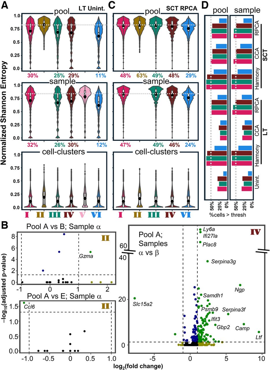
Estimation of batch effects in different designs before and after data integration. (A) Entropies of each cell in different designs are measured, and the distributions of the entropies are presented as violin plots. Entropies of pools (top), samples (middle), and cell clusters (i.e., cell types; bottom) are shown. For design V and design II, pool and sample entropies, respectively, are not shown (see text; Methods) (see Fig. 2A). The percentages on the x-axis are percentages of cells above the threshold (dashed gray line) that were chosen as the median of the pool entropy for design II. (Unint) Unintegrated; (LT) log-transformed. (B) Representative volcano plots to compare gene expression in cells from the same sample but different wells (left) and the same well but different samples (right). All plots are shown in Supplemental Figure S3. Dashed horizontal lines indicate P = 0.01. The colors in the volcano plots are for the ease of visualization and are not linked to the color schemes in any other figures. (C) Same as A but looking at the mixing in SC-transformed RPCA (see text) integrated reduced space. Design V is excluded in this representation because this design has only one well, hence cannot be integrated. (SCT) SC-transformed. (D) Percentage of cells above the pool (left) and sample (right) entropy thresholds obtained with three different integration strategies (Harmony, CCA, RPCA; see text) for designs I, III, IV, and VI. The dashed line represents 50%.