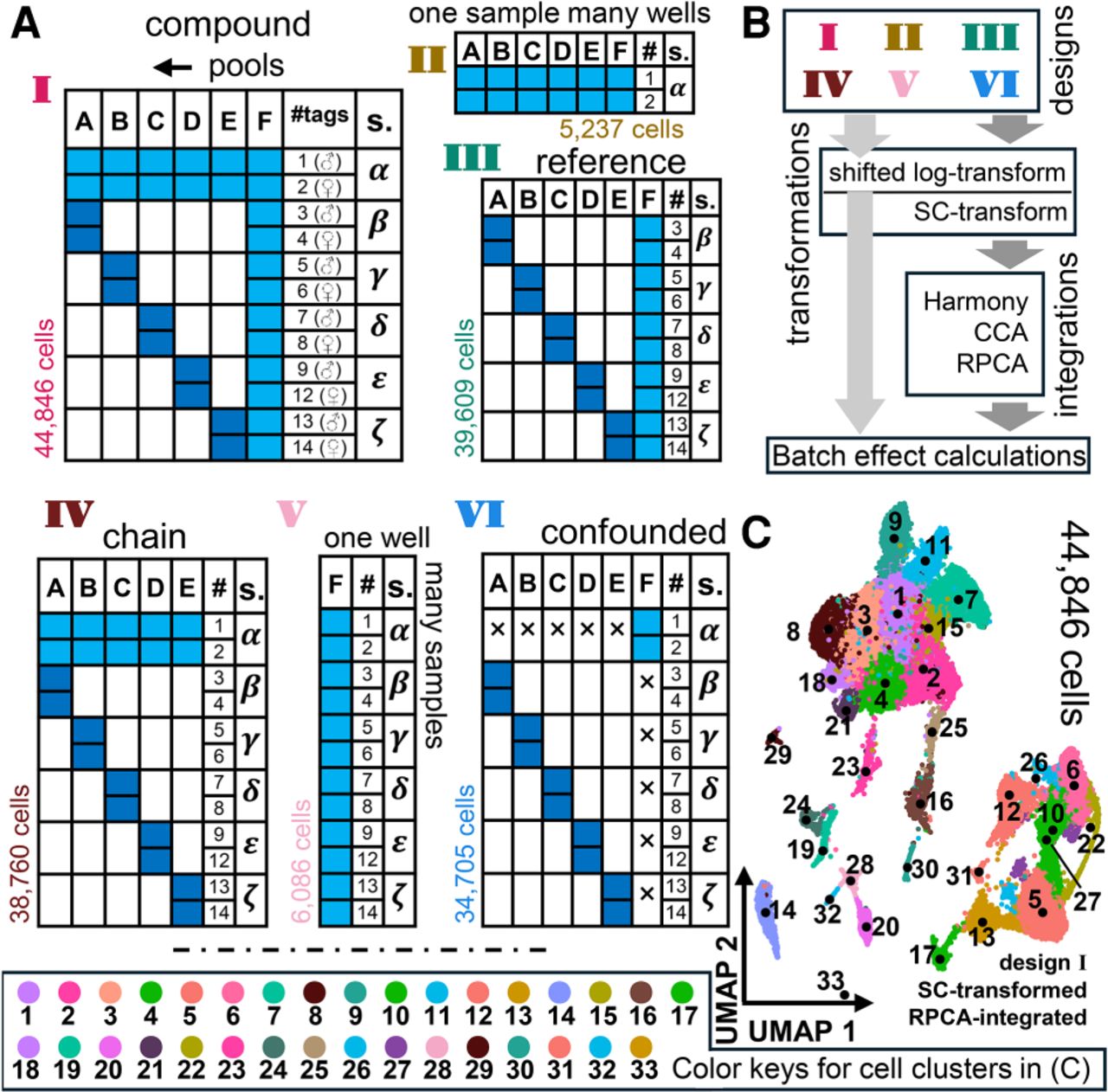
Different designs of experimental data and succeeding analytical recipes. (A) Different designs of data that are considered for batch-effect calculations. Columns in each chart indicate wells (i.e., pools A–F); rows indicate samples (α–ζ, and hashtags 1–9, 12–14). Each design is indicated by colored boxes on each chart. The lighter blue boxes indicate four times higher loading of cells compared with those in navy blue. The number of cells in each design and the design numbers in Roman numerals are shown in colors matching those used in the next figures. Design I illustrates the compound format used in the entire experiment. Descriptions of designs II to VI are given in the text. (B) A schematic of the analytical pipeline of taking the designs through the transformations, integrations, and batch-effect calculations. Light gray block arrows indicate all designs; dark gray block arrows, all except design V. For the details of the tools used under each step, see text. Each instance of the pipeline consists of one item from each of the three boxes in the diagram, namely, designs, transformations, and integrations. The latter is skipped for the “unintegrated” processing (light gray arrow) as indicated in subsequent figures. (C) UMAP on RPCA integration on the entire data, namely, design I, post SC-transformation. Contrasting colors are used for the adjacent clusters for the ease of visualization. The keys to the colors of the cell clusters are indicated in the box at the bottom. The convention of color keys used in this specific UMAP is not followed in any other figure panel in this paper. The median representative points of each cluster are indicated with a black dot along with immediately adjacent annotations of the respective cluster IDs. The annotated medians are to be used in conjunction with the color keys at the bottom; similar colors may have been used for two clusters in a limited number of instances, such as 1 and 18, 4 and 10, etc., owing to the restricted availability of adequately contrasting colors. These instances of using the same color for two clusters are carefully chosen such that the specific pair of clusters is far from each other in the projection space. Clusters 26 and 27 are split in the UMAP (splitting of cell clusters owing to projection is not unusual and is observed routinely). Thus, for instance, the median of cluster 27 lies in the middle of two split populations. The medians are plotted for the ease of visualization only; they are not related to the clustering algorithm used (see Methods).