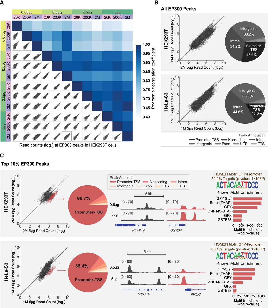
EP300 antibody titration shows that higher antibody–to–cell-number ratio better captures weaker promoter signals. (A) A matrix of scatterplots showing normalized read counts (log2) at EP300 peaks and heatmaps showing Pearson r correlation coefficients for EP300 antibody titrations in HEK293T cells with various antibody–to–cell-number ratios. We conducted a comprehensive comparison of conditions using 0.05 µg, 0.5 µg, 2.5 µg, and 5 µg of EP300 antibody (green shades) and 20,000, 200,000, and 2 million HEK293T cells (pink/purple shades), resulting in a total of 12 ChIP-seq samples. The scatterplot outlined in bold corresponds to the HEK293T sample shown in B. Note that a similar matrix for HeLa-S3 cells is presented in Supplemental Figure S6B. For HeLa-S3 samples, each antibody amount was tested in replicates, yielding a total of eight ChIP-seq samples, and the replicates for each amount were merged for subsequent analysis. (B) Scatterplot of normalized read counts (log2) at all EP300 peaks comparing 0.5 µg and 5 µg of antibody in 2 million HEK293T cells (top) and 1 million HeLa-S3 cells (bottom). The pie chart on the right shows the genomic annotations for all EP300 peaks. The peaks are annotated with HOMER, and the annotations include promoter–TSS, noncoding, intron, intergenic, exon, UTR (5′ UTR and 3′ UTR), and TTS (see legend below the pie chart). (C) Scatterplot of normalized read counts (log2) at the top 10% of EP300 ChIP-seq peaks comparing 0.5 µg and 5 µg of antibody in 2 million HEK293T cells (top) and 1 million HeLa-S3 cells (bottom). The subset of peaks that has higher signal in 5 µg of antibody than in 0.5 µg of antibody is highlighted in red. The pie chart shows the distribution of peak annotations in the red subset highlighted in the scatterplot to the left. IGV tracks show two peak loci, one in the black subset and one in the red subset. HOMER motif analysis identified the same top enriched known motifs in the red subset of peaks for both the HeLa-S3 and HEK293T cells. The motif enrichments are shown in the bar plot as −log P-values.